Unit 3, Act. 1: Images with Photoshop
This unit will introduce you to photo image editing with Adobe Photoshop. There are a lot of things you can do with images and because images of this type are made up of pixels, file sizes will be larger based on resolution of image files you work with. Previously working with Illustrator, all images were saved in vector formats, i.e. lines, shapes, and fills, therefore file sizes a lot smaller..
Course Units and Descriptions
Use this table for an overview and navigate to each of the course unit pages.
| Unit | Description |
|---|---|
| Review course outline for more details | |
| 1 | Careers and Safety- Intro, organization, software, and careers |
| 2 | Vector Production- design, create, and edit illustrations |
| 3 | Raster Production- design, create, and edit photo images |
| 4 | Audio Production- design, create and edit audio files |
| 5 | Animation- design, create, and edit vector animation |
Unit Content Activity Quick Links, Click to Jump to Specific Activity!
- Unit 3, Act. 1: The Tourist Brochure
- Unit 3, Act. 2: Web Page Background Design
- Unit 3, Act. 3: DVD Movie Poster
 Unit 3, Act. 1: The Tourist Brochure
Situation:
Using Adobe Photoshop is one of the biggest components of graphic communications and can be used to do a lot of things with raster images. It is for this reason that learning about this program and how to edit, manipulate and enhance photo images, is an important and crucial learning experience in communications technology.
Problem/Challenge:
Create travel picture for use as a possible travel web brochure or splash page. Find an exotic unique vacation destination image as your background and insert a current happy action shot of yourself in this picture as a tourist. You are required to enhance the picture with a related on-the-person and off-the-person "personal tourist accessory", a related structure, and an enticing title of the Country and local location (suitable type font, colour, effects) with a marketing slogan promoting the vacation spot. Your picture must show at least half to a full body shot taking up about 25% of final image size. When done add your logo bottom right, 100 pixel high as your signature. The image size is to be a landscape1440*900 pixels at 72 dpi in RGB colour mode. The text, yourself, and the background to be evenly balanced and emphasized with the focus priority on travel scene, yourself, and then the text/type. Remember to take in account your composition which includes the Rule of Thirds, symmetry, leading lines, and our previous review of the Elements and Principles of design.
Your goal is to create accurate selections and colour match the picture of yourself with your chosen background. Using adjustments, layers, masks, colour, and brightness control to familiarize yourself with some of Photoshop's tools. Careful attention to accurate object selections (your mask cut-outs), perspective, blending, layers, colour matching with hue, saturation, and brightness (luminosity), contrast/blur and shading, of objects to fit the composition scene, to make as realistic as possible.
Investigation/Ideas:

Photoshop Intro
As this is the first time using Adobe Photoshop, you will need to familiarize yourself with the program and its image edition tools. Here are a some images showing the interface of this program:
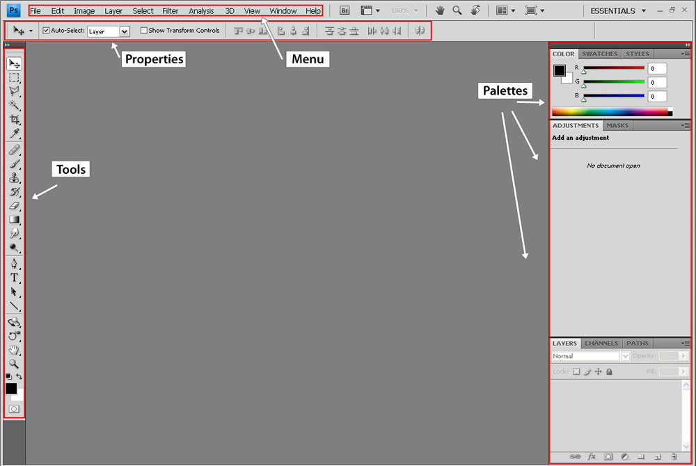
Main Interface
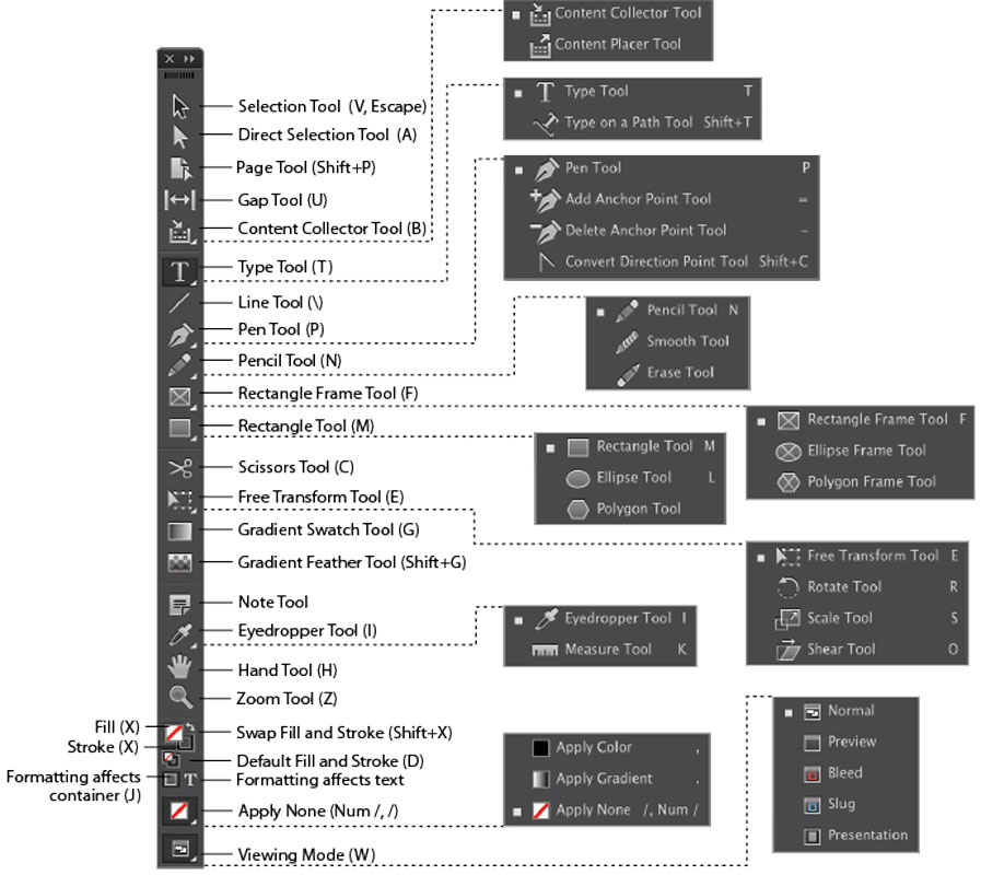
Tool Bar Icons
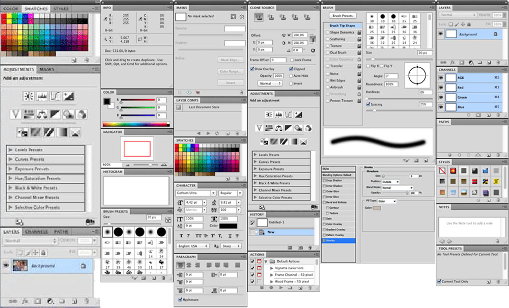
Some Pallets
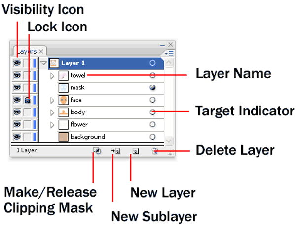
Layer Pallet
There are several components of Photoshop that you need to be familiar with. Fortunately having some experience with Illustrator, you already have some experience because of the overlap of similar tools and operation. The list of Photoshop tools, panels, process, and info below is to be reviewed, so that you can work effectively with raster images to edit, modify, and change images effectively.
- Interface
- Tool Bar Icons
- Tool Pallets
- Application Menu
- Workspace
- Adjustments
- Preferences
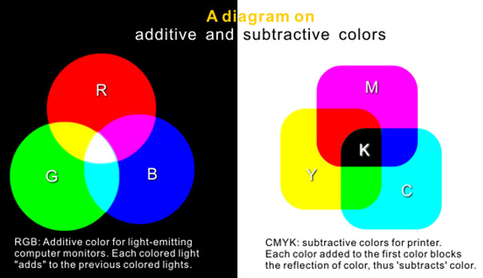
- CMYK vs RGB
- Photo Resolution
- Dots Per Inch, dpi
- Selection Tools
- Inverse
- Viewing Tools
- Transformation
- Image sizing
- Canvas sizing
- Cropping
- History Pallet
- Layers
- Smart Objects
- Save As
Workspace and Setup
Setting up your workspace similar process as in Illustrator with your panels and you can adjust settings in Preferences, tool-bar, Keyboard Shortcuts, etc. from the Edit menu. By default, you already have a general set-up, but you will want to review all of these settings and panels to how you like it. Check out the ![]() Settings and Workspace 11.14 video to get some ideas on what you can do for your set-up and workspace.
Settings and Workspace 11.14 video to get some ideas on what you can do for your set-up and workspace.
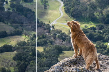
Composition
Composition refers to the way the various elements in a scene are arranged within the frame. It is how the artist puts those elements within a frame that help a scene become more or less interesting to the viewer. A good scene/photograph will take in-account many different parts and combine them into an aesthetically pleasing image whole. The Rule of Thirds is a great place to start, then start to look at the symmetry, leading lines, framing, etc to control the viewers eye and create a pleasing image to the viewer. Below are some videos you can check out reviewing these key elements.
 How to activate Rule of Thirds in Photoshop 2.21
- Understanding the RULE of THIRDS 5.31
- 4 Framing & Composition Techniques for Beginners 5.31
- Rules of Framing and Composition 8.16
Resource Links
Below are some linked resources introducing you to Photoshop, its interface, workspace, tools, panels, layer control and colour adjustments, brightness, masks, subject placement, perspective, colour matching, etc.
- Adobe PS User Guide
- Adobe PS Tutorials
- Adobe PS Workspace
- Settings and Workspace 11.14
- Adobe Tool Galleries
- Workspace & Interface
- Intro Guide
- The Workspace 9.03
- Basics
- Essentials Tutorials
- Getting Around
- Customize Tool bar
- Workspaces
- Manage Workspaces
- Layer Shortcuts
- All the Shortcuts
- PS Quick Intro Basics 13.10
- Candid Quick Intro 14.18
- Every Tool Demo 45.41
- Select & Mask 9.13
- Project Learning 2.06.31
- Smart Objects
- Smart vs Raster
- Layer Masks 32.10
- Masking Methods 8.53
- Hair Removal 11.41
- Match colors of images 16.08
- Match Subject 30.14
From our last unit you may remember several online resources such as Dribbble, Behance, Unsplash, Designnspiration and colour.adobe are all great graphic resources, but you may want to try some other sites such as Pixabay, Pexels, Freepik, Unsplash, and/or Vecteezy. Remember to respect copy-write laws and protecting the rights of others with respect to images. Keep in mind this may also include learning about and following through with attributions and acknowledgments of the source of an image when required.
![]() It is always a good idea to edit images in higher resolution if possible, such as masking out a person from the background, do this with the original larger file first, then scale and/or down-size to size you will need. Because this brochure is for the web, the image only needs to be 72 dpi, but you are better to edit images in their native original higher resolution first. Crop what you don't need then use a mask (non-volatile) to separate your images from there background.
It is always a good idea to edit images in higher resolution if possible, such as masking out a person from the background, do this with the original larger file first, then scale and/or down-size to size you will need. Because this brochure is for the web, the image only needs to be 72 dpi, but you are better to edit images in their native original higher resolution first. Crop what you don't need then use a mask (non-volatile) to separate your images from there background.
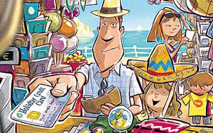
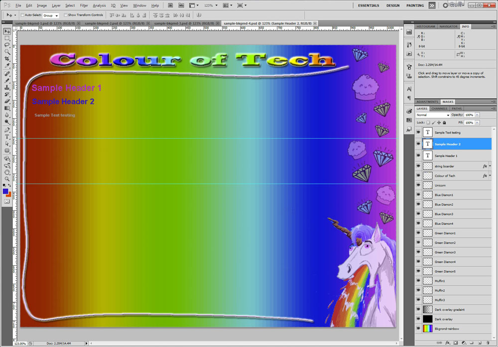
Student Samples
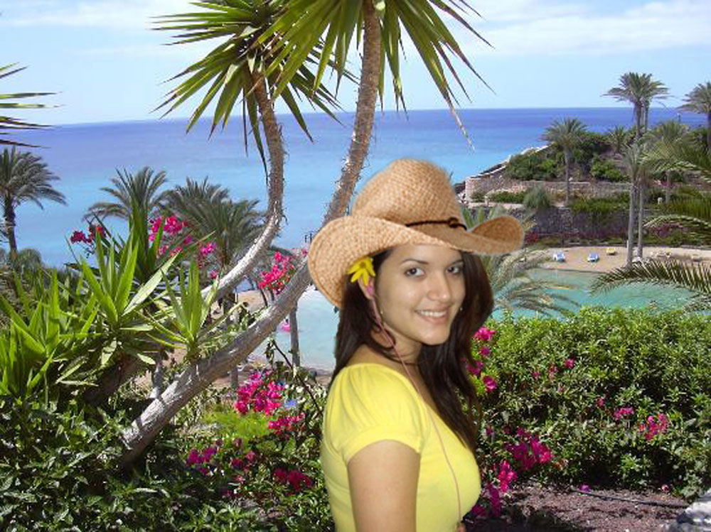
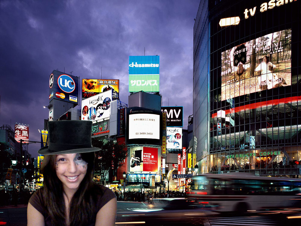
Here are some samples past student work showing themselves inserted into a travel destination with a hat related to the destination, although you will be focused more, on bringing in several objects with colour image matching:

Sample 1
Sample 2
Sample 3
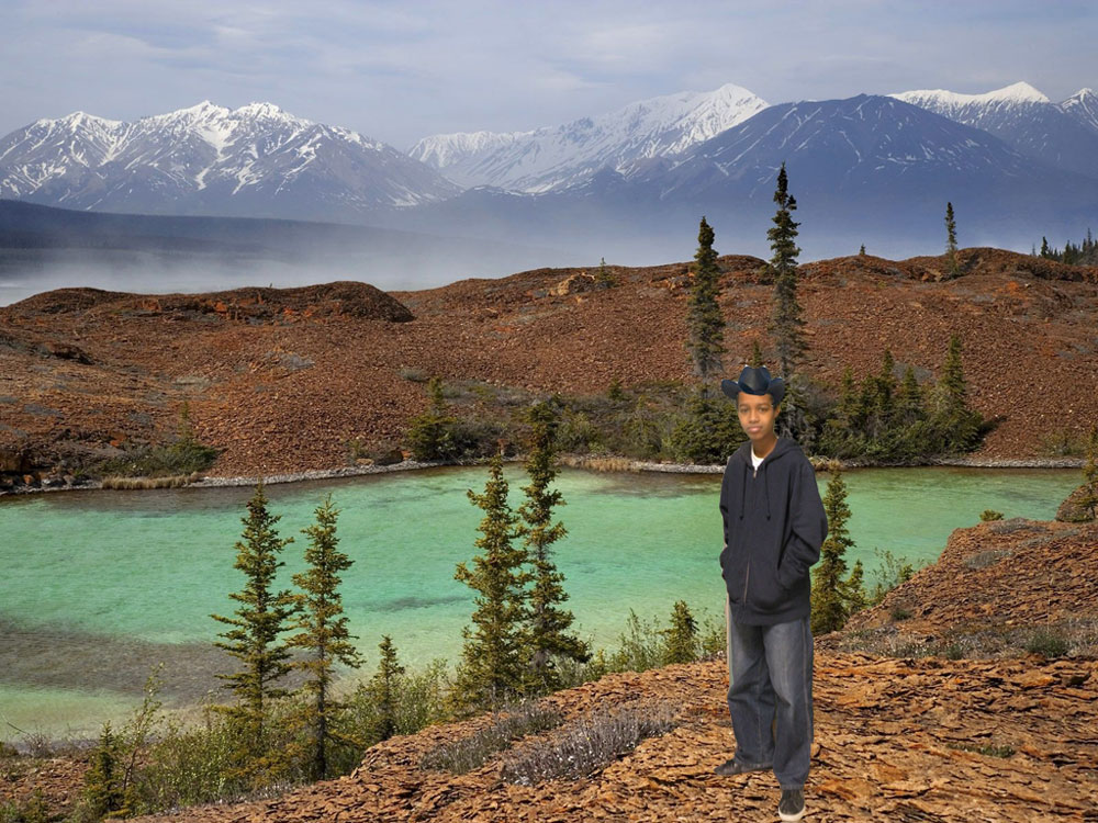
Sample 4
Create/Construct:

Steps To Take
Use the following steps to as a guide to complete the project. Each of the steps will be chunked down to smaller assignments to ensure you are on track and will be able to complete with the proper steps.
- Familiarize yourself with Photoshop by checking out the support intro tutorials, videos, first-hand familiarization of the interface, exploring the different tools, panels, and then complete the Photoshop Introduction and Interface work sheet
 , (refer to Adobe Reader commenting) to be later peer evaluated/taken up in class for marks
 - Decide and get two vacation backgrounds to start with, then have someone take some quality happy action tourist pictures of yourself (whole body in focus with clear face shots) taken in various positions and angles (3 minimum, so you have something to work with) with a solid colour wall or door behind you for easy masking later on. Keep in mind an interested exotic tourist location location, action, clothing and body positions.
- Ensure your travel, body, and object images you collect for this project will fit and have good size and resolution so there are no pixelation issues on your final product
- Attain and collect all of your required asset resources: - 2 possible backgrounds, 3 different images of yourself, 2 accessories, 1 structural, and the text and font type you plan to use (Country, location, and travel slogan) to create a 1440*900 PPI mood board submitted as a PSD and JPG. All images embedded smart objects spread out evenly on page with 20 PPI edge guides and 60 PPI header space for centre title and owner info top right. Remember to name your files before placing your embedded images into Photoshop
- Create and save a practical workspace that you will be able to use, to complete Photoshop assignments and show/submit a workspace screen capture with the manage workspace drop-down window open showing your saved workspace, and also include in your capture the Help Discovery window showing first 4 orientation tutorials completed, as a JPG
- Using your mood board, hide your layers and create a Rule of Thirds grid, then select your final travel image and fitting to your full page, keeping in mind rule of thirds and picture composition as you start to build your travel tourist scene
- Decide on which image you will use of yourself, use the crop tool, if needed to crop yourself, then using selection tools and fine tuning, mask yourself from the background so you can insert yourself into your travel scene
- Do the same for other objects you have decided to bring in, while keeping your layers organized and named, and keeping, scale, emphasis, and design composition in mind
- Working with the colour and brightness adjustment tools, do your best to match/blend your individual images with your scene.
- Add your type: Country and location with a marketing slogan, taking in account colour, font, size, brightness, and effect to suite composition and consistent visual expression
- Add your logo in the bottom right of the screen, as your signature, 100 pixels high
- With your finished picture, save the PSD and also a JPG with proper file naming convention to submit, and also share the JPG in the JamBoard for class student project share showcase
Evaluation:
Double check instructions in each of the chunked assignments before submitting work. Remember to use the proper file naming convention for work submitted.

| Photoshop Interface Assignments | Marks |
|---|---|
| Always double check that you have completed all components for full marks. | |
| Interface Tool bar Answers - what the tools does, what you could use it for in this project | 10 |
| Interface Menu Answers - commands explanation and example of use in this project | 10 |
| Mood Board - all asset images on one page, country, location, slogan | 20 |
| Custom Workspace - 4 tutorials done, organized, panels, tools with managed window | 12 |
| Tourist Brochure | |
| Travel Background - image size, travel destination, colours | 5 |
| Person(you) - accurate masking, colour and brightness adjustment blended with background | 10 |
| Accessories and structure - Related travel object fit, masking, colour, realism | 15 |
| Type - Use of colour, font, size, fit, emphasis, effects, etc. | 5 |
| Technicals - Layers named, tools, colour adjustment, PSD and JPG handed in, file name | 10 |
| Design - image placements, colour, brightness, blending, emphasis/balance, logo | 10 |
| JamBoard- Placed and sized correctly on board 7 with 3 for class integration | 10 |
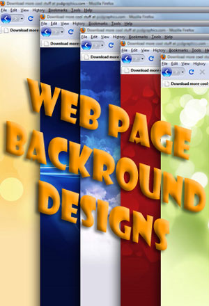
Unit 3, Act. 2: Web Page Background Design
Situation:
Using Photoshop to create your own graphics using graphic manipulation tools is a great way to make up your own custom graphics. Photoshop has many tools in order to do this. Looking at some of these tools will help you understand the power and infinite possibilities of what you can do with this program.
Problem/Challenge:
Create a web page background from scratch that can be later used to display work done in this class as a digital web portfolio. It will require the following:
- A standard web Setup with a size of 1024 * 768 pixels
- Minimum of two course related images with a theme in mind, the rest is from scratch
- Colour combinations to suit contrast of text
- Background fill with either a colour or gradient
- Use of one or more filters and blending to achieve background effects
- Use of type, to create a "Tech" title with blending and filters with-in top 100 pixels
- Centre design consistency/repetition for web page body expansion if necessary
- Show sample text colour(s) for header 1 and 2 and normal text, using Ariel font 18, 22, and 24 point starting at pixel co-ordinates 40x, 120y.
- Accessory created using the pen tool in combination with brush or pencil tool (10% of page minimum)
Investigation/Ideas:
Similar to the course logo, you will need to think about the three areas of the course, and come up with two images that interest you and can be tied into a theme direction that shows your interest. It is always important to frame in your body by creating subtle image highlights outside the body. This way whatever is being presented in the body does not get distracted from the background, yet the background will support or enhance your work in the body.
Some more tools will be reviewed for use with this project which are as follows:
- Pen tool
- Pencil and Brushes
- Type text tool
- Layer Styles and Effects
- Filter Effects
- Fill and Opacity
There are lots of ideas you can find on the Internet, although this project is specific to our course, you will need to create this project from scratch. Below are some linked resources that will help with this project.
Resource Links

- Sample Backgrounds
- Text Effects
- All About Brushes
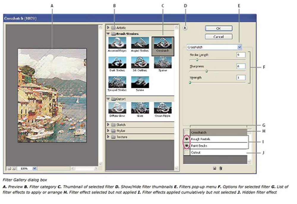
- Filter Gallery
- Opacity vs Fill
- Layers Tutorial
- Layers Styles
- Layers Panel Essentials
- Pen tool
- Pen Tutorial
TIP: Ensure that your design allows for expansion in the centre just in case you need to lengthen you web page. Web programing code can allow a cut image across the centre to be repeated as many times as necessary to lengthen the background graphics as long as needed to accommodate the information on that page. Each of the samples below when clicked go to a larger image showing guide lines as to where the expansion would be used.
Create/Construct:
Below is the suggested steps you should take to complete this project in a timely manner.
- Get a minimum of two images from the course sections.
- Open each image separately and separate from backgrounds and size appropriately to bring into web background page
- Create standard web setup with a size of 1024 * 768 pixels for your web background page
- Place images in, naming each additional layer appropriately
- Create your background colour fill, filter effects, and layer styles
- Insert your page "Tech" title and work on font, size, layer blending options, and possible filters
- Decide on how to incorporate your pen/brush tool component and add
- Add guide lines to show where you would cut out the centre for expanding the page lengthwise
- Add header and text samples with appropriate contrasting colour
- Save as a both a PSD and JPG file for hand-in
Here are some samples of past student work:
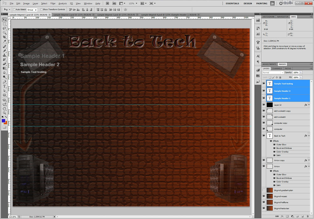
Sample 1
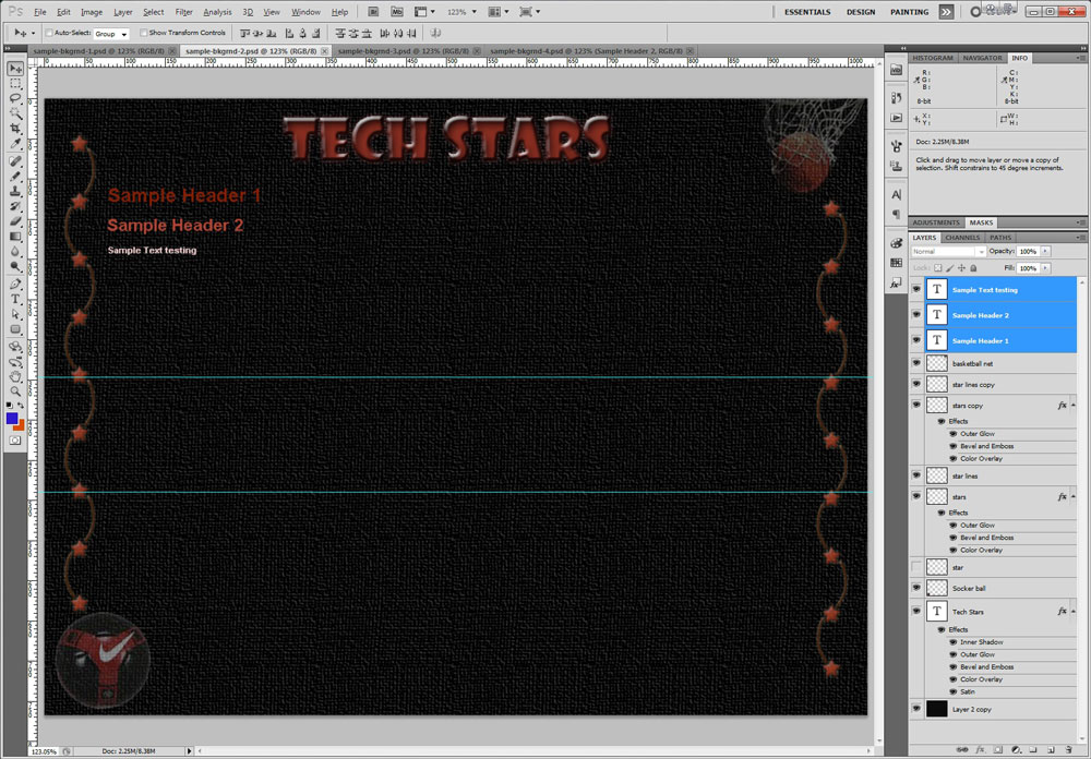
Sample 2
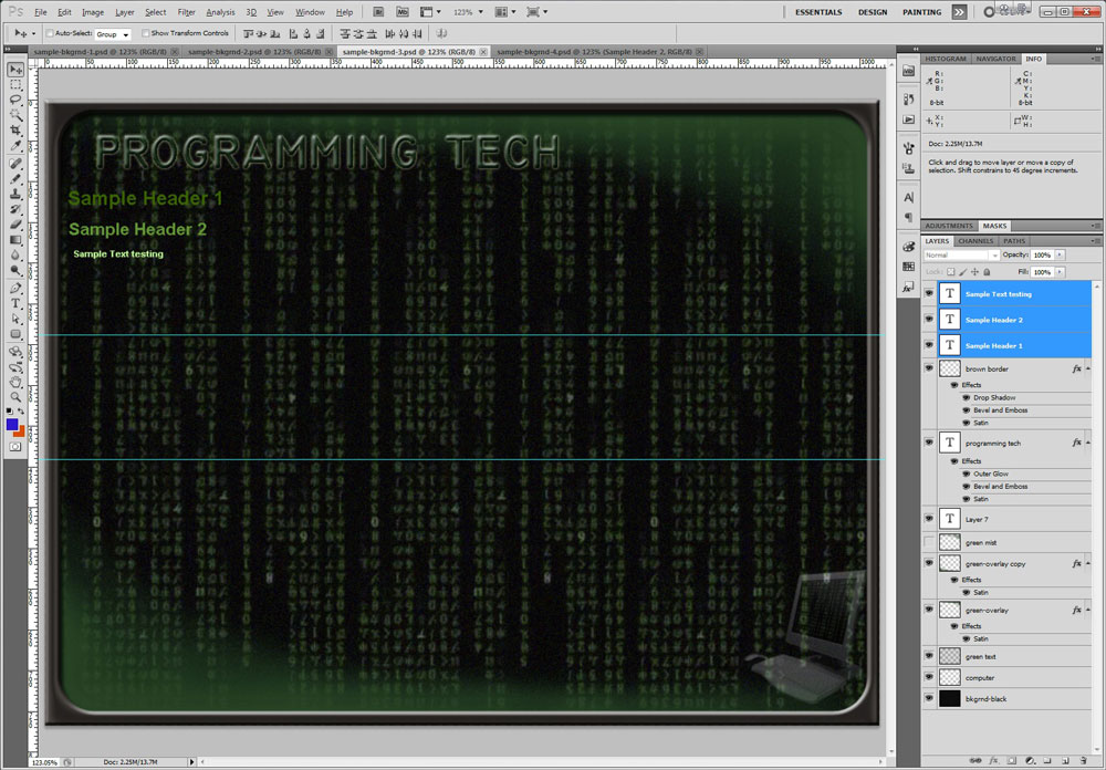
Sample 3
Sample 4
Evaluation:

Ensure you hand your work into the appropriate hand-in folder as reviewed in the last activity with the correct file naming convention in both PSD and JPG formats.
| Photoshop Web Page Background Design | Marks |
|---|---|
| Always double check that you have completed all components for full marks. | |
| Images - Minimum 2 appropriate placed, subtle with pen/brush creations | 10 |
| Background - fill -Pattern, colour, gradient, filter effects, and blending | 10 |
| Text - Title and sample text appropriate font, colour, sizing, blending, and filter effects | 10 |
| Final Image -colours, tech theme, centre expansion, overall look and design, PSD and JPG | 10 |
| What Did you Learn - Test your knowledge here: | |
| Moodle Quiz - Based on above work covered, log-in here, help with quiz access/process | 10 |
| Total Marks | 50 |
Unit 2, Act. 3: DVD Movie Poster
Situation:

Photoshop can be used to do some amazing things. Having some fun using original photos and improving or personalizing can be really fun making them more interesting and personal.
Problem/Challenge:
Find a favorite movie / poster that you can use to make it your own to improve and personalize your name, your face, and two movie related objects inserted. The face is to have at lease one photo touch-up. The movie poster must have the following requirements:
- A standard web setup with a portrait size of 800 wide * 1000 pixels high
- Duplicate layers locked and untouched showing original movie poster background and your face - this is for comparison later
- Must have a face size 20% of page with yours to be put on top
- Face to have minimum of at least two photo touch-ups and match current colour tones
- Adjustment layers to be used for face, objects, and overall picture improvements
- Your name prominently placed and matched with current type style
- Include two objects with a minimum 20% sizing to page, one of which is partially behind part of the background movie poster
- Layers named appropriately with original face and movie poster layers locked
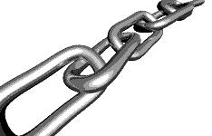
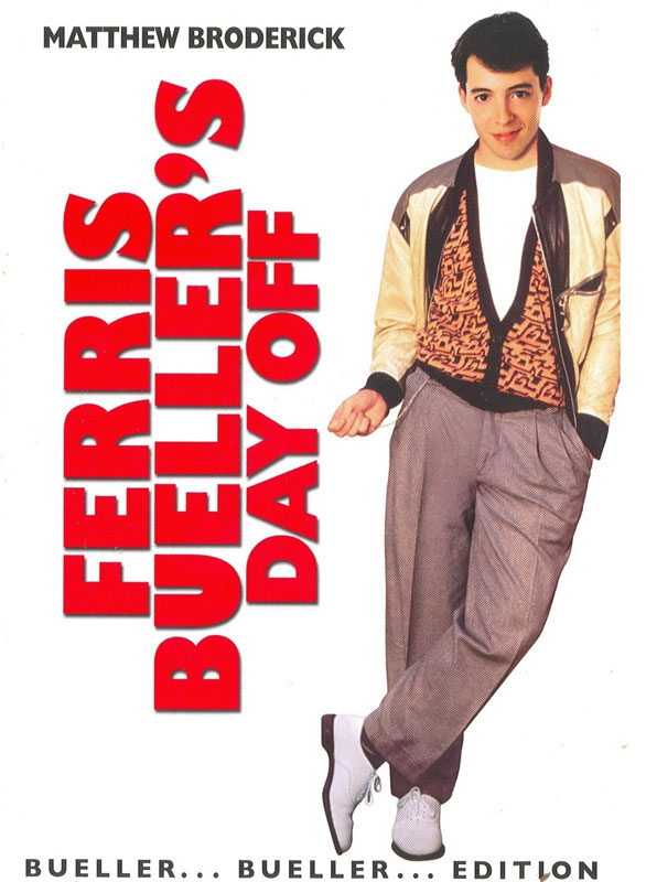
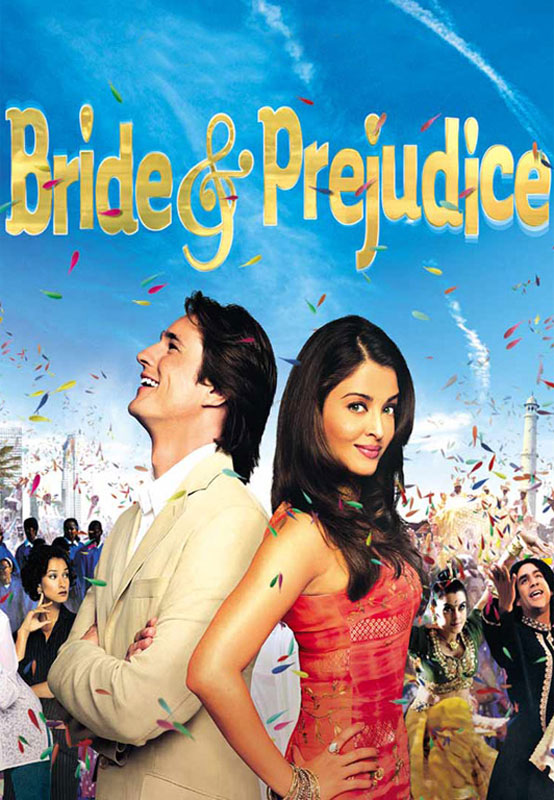
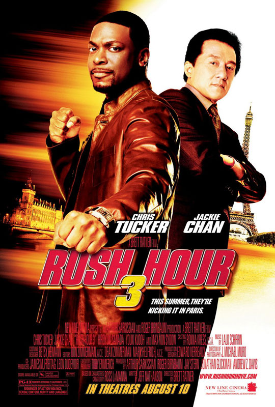
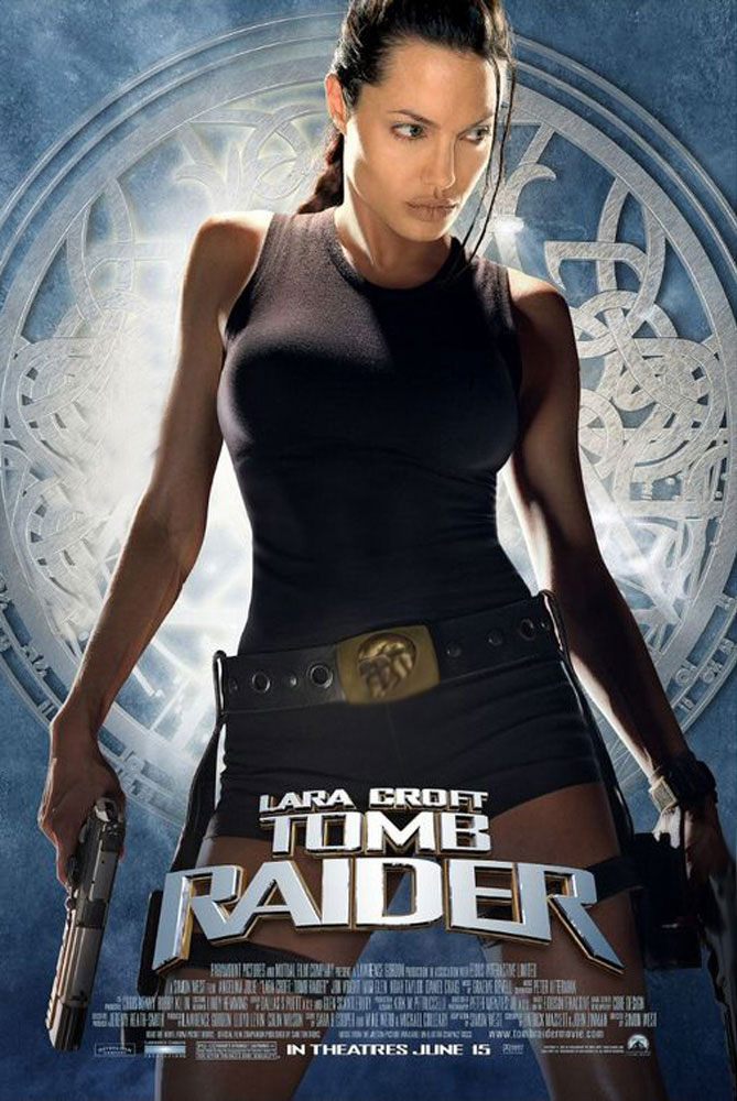
Now that you know what is involved, click on the image on the right titled What's Your Favorite Movie? and see if you can guess which movie posters work and which ones don't. Use the mouse to mouse over to see the answer for each of the movie posters. Check with your teacher prior to working on your poster, to confirm that you are OK, to use that movie poster image.
Investigation/Ideas:

This project is focused on customizing original images with your own face and while improving the original poster graphics. The type tool will be used to get as close to the posters type font/style as you can, to match and blend with posters text. Objects brought into the movie poster are to support and be related to that movie such that you are improving the poster. One of the two minimum objects is expected to be placed in behind current background of the movie poster to give the illusion that it is in the background of the poster.

Adjustments and Presets

Hue/Saturation

Adjustments Layers
Adjustment layers are to be used as one of the major focused tools in this project. The adjustment layer has 10 different types of adjustments you can use to apply to either a selected object, a layer, or the entire poster. What is key with this tool is similar to the Layer Styles tool we looked at last project, is that it is nonvolatile to the image, i.e. you can turn it off any time, or adjust it to suit your image needs without affecting the original image/pixels.
Some more tools will be reviewed for use with this project which are as follows:
- Adjustment Tools
- Spot Healing Brush
- History Brush Tool
- Dodge, Burn Tools
- Blur and sharpen Tools
- Clone Stamp Tool
- Pixel Masks
- Images to Behind Background
It should be easy to find your favorite movie / poster online, just make sure it is has a minimum of the size required for this project. It would also be a good idea to get one with a head shot of an actor with a minimum of 20% of the page size and make sure the text will be relatively easy match using fonts from Photoshops' library. Note, Google search engine has a Find More Sizes feature, so if you don't have a large enough movie poster to start with, you should be able to use this Google feature to find larger sizes. Below are some linked resources that will help with this project.
Resource Links
- Movie Posters
- Adjustment Layers
- Beauty-Retouching
- Teeth Whitening and More
- fonts.com
- Spot Healing Brush
- Blur, Sharpen, and Smudge Tools
- Dodge, Burn, and Sponge Tools
- Clone Stamp and History Brush Tools
- Masks
![]() When you have a brush type tool selected and want to change the size, a quicker way to adjust the size of the brush is to use the left and right brackets by the enter key on your keyboard.
When you have a brush type tool selected and want to change the size, a quicker way to adjust the size of the brush is to use the left and right brackets by the enter key on your keyboard.
Student Samples
Here are some samples of what students selected as their original movie posters selected to work with:
Original Sample 1
Original Sample 2
Original Sample 3
Original Sample 4
Below are some samples of what students did to improve and include themselves in their selected movie posters:

Customized Sample 1
Customized Sample 2
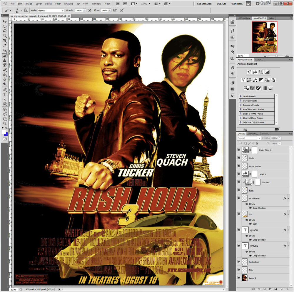
Customized Sample 3
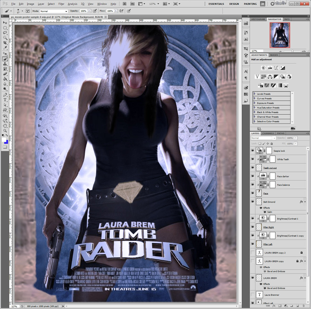
Customized Sample 4
Create/Construct:
Main Steps to Complete
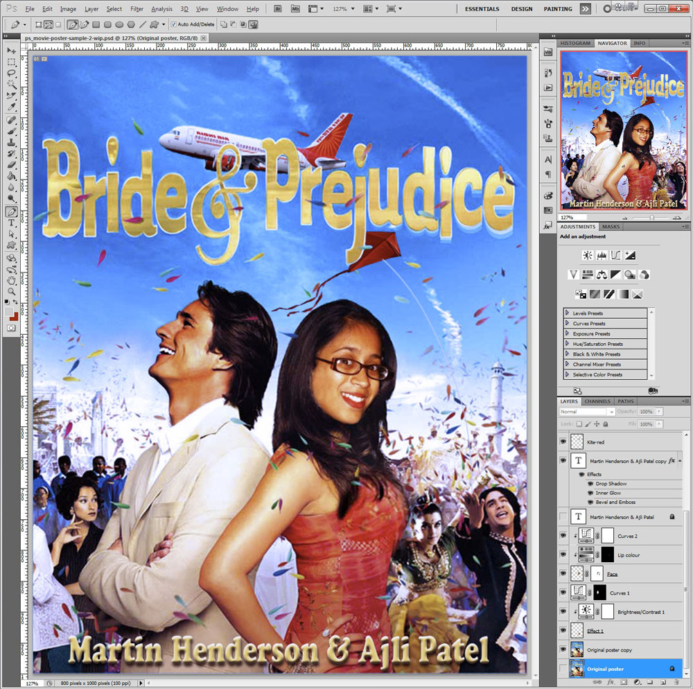
Here is another example showing major steps - Original, Get secondary images including your face, then Blending them into the DVD Movie poster. Look closely at the final image in Photoshop and note all the layer adjustments and masks used in the layer panel

Original

Additional Images

Blended Images
Detailed Steps to Complete
Follow the steps below to complete this project in a timely manner.
- Find a poster with your favorite movie that you want to work with
- Get a minimum of two images that relate to your movie
- Open each image separately and separate from backgrounds and size appropriately to bring into poster
- Create standard web setup with custom 800 wide by 1000 high pixel sized art board for your movie poster
- Duplicate the original movie poster , then lock the original, turn layer eye off, and continue working on duplicate (this is for comparison with your finished version later)
- Place images in, adjust, size, transform if necessary and ensure all your layers are named appropriately
- You may need to duplicate background movie poster layer again to use portions for overlap of your selected image to have it appear behind objects in the background
- Duplicate your original face image , then lock the original, turn layer eye off, and continue working on duplicate (this is for comparison with your finished version later)
- Cut out one of your face shots appropriate for the movie poster, scale, carefully select just the head and neck, move into movie poster
- Fitting your head will require some tools such as scale and rotate to place appropriately.
- Make two photo touch-ups such as teeth whitening, eye colour, blemishes, pimples, etc to fix (see support links above on tutorial steps)
- Use the colour adjustments tool to match skin tone, hue, brightness, and colour levels with the rest of the poster and skin body parts
- Using the type tool, type your name, as one of the actors in relatively large lettering, then match font, style, and colours
- One of the last steps is to use adjustment layer tool to get your overall final effect you want, to improve your movie posters look
- Save as a both a PSD and JPG of your finished movie poster and ensure that you have the original movie poster and your face shot as hidden layers as your top two layers
Evaluation:
Make sure you hand in three files with appropriate file names such as the samples above. Double check that you have named all of your layers for identifying what each is. The original background and original face layers will be compared to your touched-up layers.
| Photoshop Web Page Background Design | Marks |
|---|---|
| Always double check that you have completed all components for full marks. | |
| Minimum of Two Images -appropriately placed, one in behind a background object | 15 |
| Face - (duplicate original) two touch-ups, colour, skin tone matching, scale, and face fit | 15 |
| Text - appropriate font, colour/sizing closely matching current font style | 10 |
| Final Image - (original poster) colours, adjustments, overall look and design, PSD and JPG | 10 |
| What Did you Learn - Test your knowledge here: | |
| Moodle Quiz - Based on above work covered, log-in here, help with quiz access/process | 20 |
| Total Marks | 70 |