
Unit 2: Grade 10 Vector Production
In this unit, you will be introduced to the creative design process including elements and principles of design. Part of that process, will be coming up with ideas, creating sketches using artistic sketching techniques, and organization into workable solutions/products. Using vector applications is a very powerful method to communicating graphically using points, lines, outlines, and fills along with digital related tools, to create digital and scalable graphical solutions. We will be focused on using Adobe Illustrator, the industry standard in vector design, creation, and manipulation.
Course Units and Descriptions
Use this table for an overview and navigate to each of the course unit pages.
| Unit | Description |
|---|---|
| Review course outline for more details | |
| 1 | Careers and Safety- Intro, organization, software, and careers |
| 2 | Vector Production- design, create, and edit illustrations |
| 3 | Raster Production- design, create, and edit photo images |
| 4 | Audio Production- design, create and edit audio files |
| 5 | Animation- design, create, and edit vector animation |

Unit Content Activity Quick Links, Click to Jump to Specific Activity!
- Unit 2, Act. 1: Onomatopoeia Brain Teaser
- Unit 2, Act. 2: Graphic Logo Design
- Unit 2, Act. 3: Design Your Dream House
 Unit 2, Act. 1: Onomatopoeia Brain Teaser
Situation:
Being creative in Cyber Arts you will need to learn and exercise a creative design process. This process includes several steps that allow you to start with an idea and come up with successful creative design(s). Using an onomatopoeia as our focus, we can go through the proper creative steps and also learn how to manipulate text in several ways working with the type tool and related editing tools.
Problem/Challenge:
Using the creative design process through hand sketching ideas and finalize with digital illustration, create two final onomatopoeia words to look like they sound. Start with a simple sketching assignment to build some basic sketching skills and experience. Then pick 4 unique words to sketch 1/4 page thumbnails showing possible onomatopoeia ideas. Using illustrators' type tool and related editing tools on a 1280 * 1024 landscaped standard web page format, create two separate onomatopoeias, one at a time, using just the text and related editing tools in Illustrator, with no additional graphics and/or background added. Product to be saved in .ai and .jpg formats for submission and also share jpg's on class JamBoard class page.
Investigation/Ideas:
This section will look at three major areas. First look at what an onomatopoeia is and some resources on it, then we will look at freehand sketching, why it is still an important skill to have whether on paper or a digital tablet, sketching techniques, and process. Last, we will look at Illustrator, a vector drawing program and its specific purpose compared to other digital graphic applications.
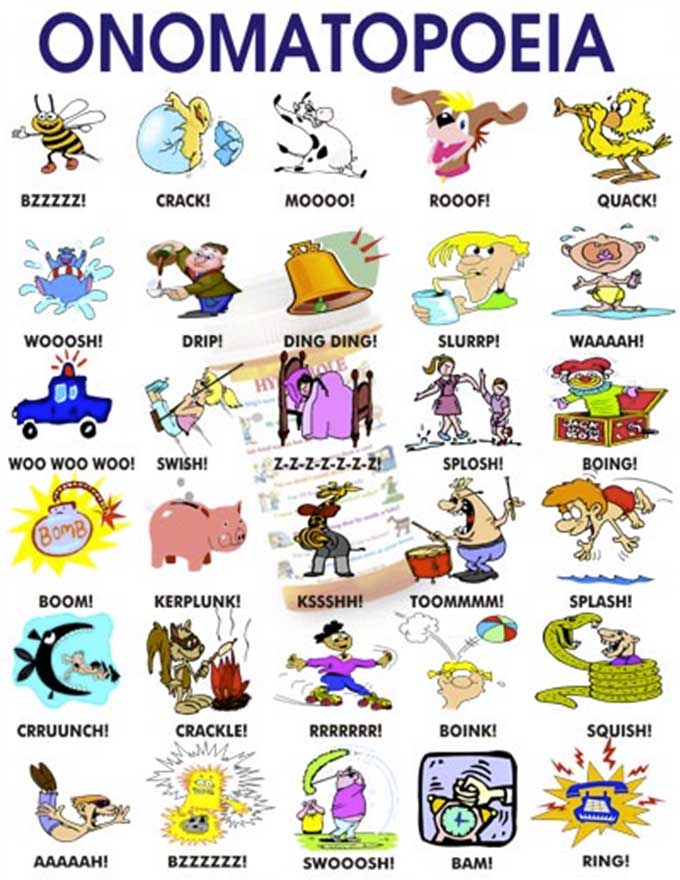
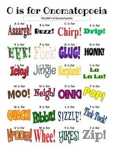
Onomatopoeia
What is an onomatopoeia... well in basic definition, it is a word that imitates or suggests the source of the sound that it describes. This means that the word you select needs to represent a sound and it is up to you to decide what that sound would visually look like graphically, based on how you see that sound graphically and apply it to the text, giving it a custom, creative, and graphic visual response. Some examples of words that could be used as onomatopoeias are: "Ping", "boom", "squelch", "bang", "click", "fizz", "hush", "buzz". Check out the links below for more details and ideas to use for your project.
 What is Onomatopoeia? 2.38
- Onomatopoeia creative project 2.01
- Dictionary of Sound Words 2.04
- wiki List of onomatopoeias
- List, examples, & definitions
- More about onomatopoeia
- Images of onomatopoeias
Sketching Introduction
Sketching is a very important skill to practice and develop. This is more commonly used in the traditional art areas, but still has a place in digital graphics to save time Sketching allows you to quickly generate visual graphic ideas on paper. There are several techniques that can help you build and develop your skills for sketching.
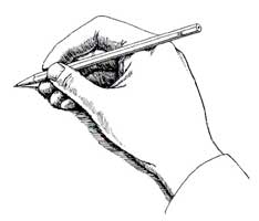
- pencil holding, spin, wrist, arm, shoulder
- Layout and organization
- weight light construction, heavy outlines
- base lines and straight lines
- clean curves, and smooth circles
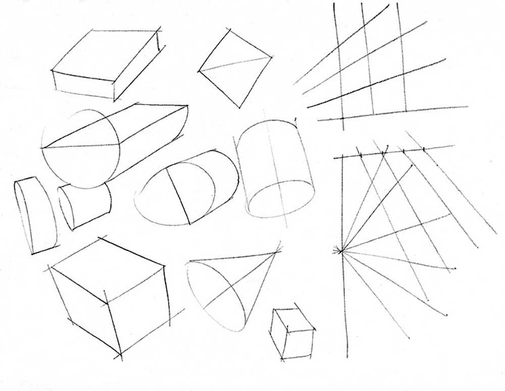
- basic shapes 2D and 3D
- textures, shading and light sources
Here are some resources to check out showing how to build your sketching/drawing techniques and practice them:
- Warm-up techniques, and more
- Using Wrist vs Shoulder
- Improve your Drawing
- Traditional Drawing Techniques 13.33
- Outlines, Edges, Shading 8.20
- Tablet sketching 10.01
- Sketching skills
- Sketching exercises
- Simple Exercises
- Drawing Exercises
- Line Drawing
- Interesting M
- Basic Geometric Shapes 25.5
- Draw Anything with the help of basic shapes 14.14
- Additive And Subtractive Methods -hand 26.12
- Additive & Subtractitive methods -tablet ...17.04 - 21.07
- Fundamentals: Shapes & Forms 15.59
- In-Depth: Your best friends - Cube, Sphere, Cylinder 2.08.57
- alphabet letters A - Z in 3D 19.31
- Do 3D Letters 16.42
- 3D In Graffiti 9.37

Sketching Tips
- lettering sizing is generally 6 mm for titles, 3 mm for normal
- Using two parallel lines will ensure consistency and straightness
- speed will smooth out your lines (remember bicycle analogy)
- ensure circles are large (full size, using up most of the space)
- create circles using cross-hairs first, then marking space from centre, then smooth circle hitting all space marks
- try to keep page straight to practice different directions
- include all text and sketching for full marks,some forget to fill in the two key points below the title and reference
- don't erase, just keep practicing and use back or another sheet if necessary
- start a new sheet and staple all of your practice sheets together, with final (best one to be marked) at the front
- don't worry so much about stopping exactly at each corner of objects
- practice on back and Astrix the ones you would rather the instructor mark
- making shapes a light construction line for the base line will help with shape creation
- for complex shapes, use additive or subtractive sketching methods
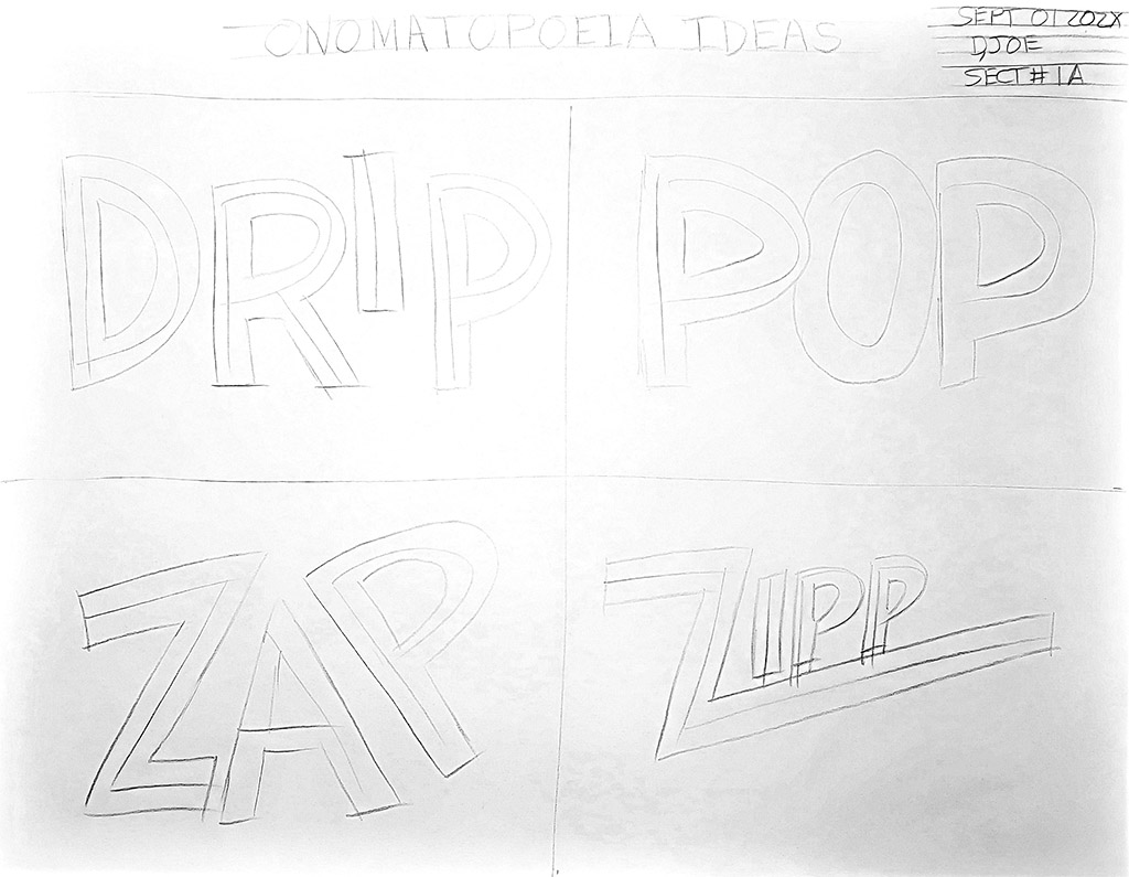
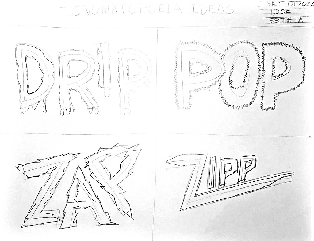
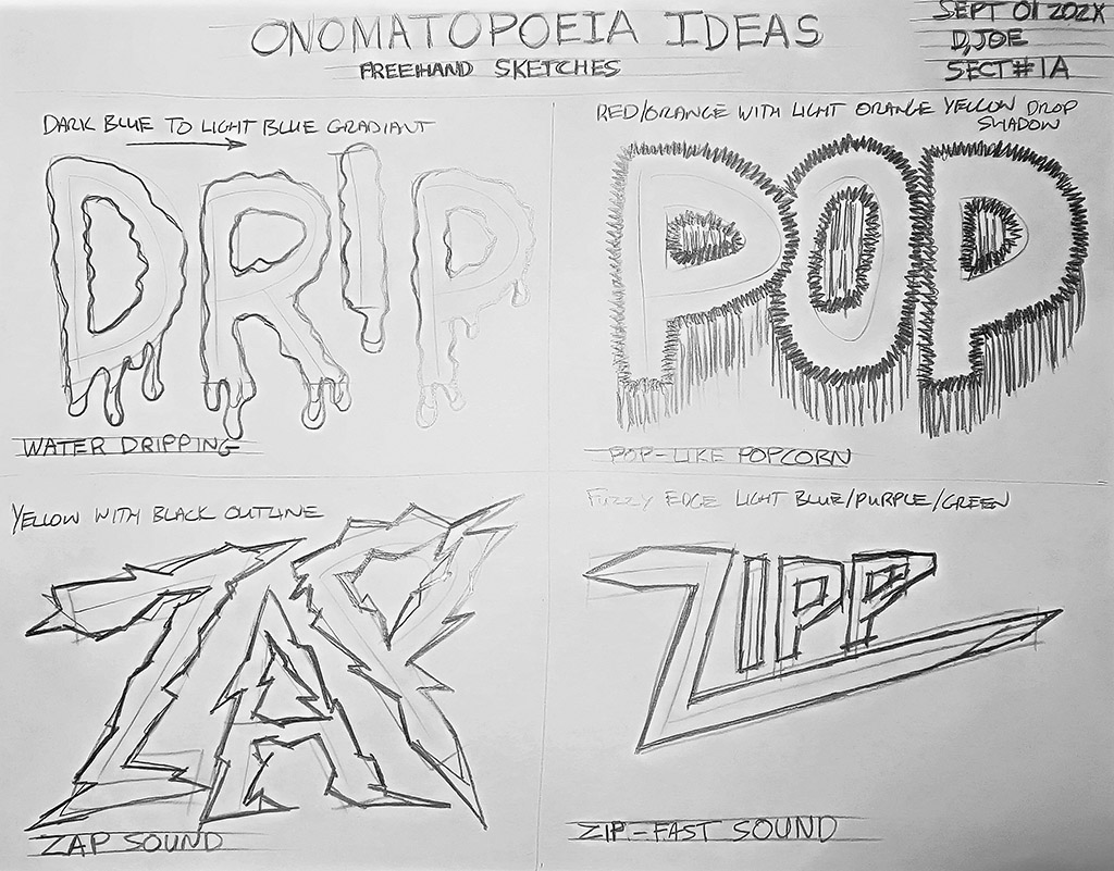
How to sketch 4 thumbnail Ideas
The below 4 freehand sketches in pencil, show the process, steps, techniques used to create 4 design ideas. The following four points go over the steps you should be taking to complete your sketch ideas correctly.
- Start by slightly folding paper vertically and pinch ends, then fold horizontally bottom to 1 inch below top and pinch ends, then draw light construction lines (shoulder technique) for header area and your four equal quarter sections for your thumbnail sketches, then wire frame your four onomatopoeia words into those four spaces, maximizing the space available using light construction lines
- Fill in your header using guidelines for text - title, date, name, section with light lines, then sketch your font/style letters, i.e. thicken up letters to what type of font you are considering with light construction lines
- Now the fun creative part, add the special effects you want to show, so that your word will look like it sounds - remember you are only allowed to edit modify the text type only, no additional graphics or colour background, i.e. leave white background
- Last step, darken up your object outlines to a thicker darker line weight starting with the title, date, name, and section number, then (if you are right handed) work on the first quad section - left top section, and darken up those object outlines, then top right, then bottom left and finally bottom right, make sure you label each idea with colour, design ideas, word and sound it is to represent

Step 1
Step 2
Step 3
Step 4
Illustrator Introduction

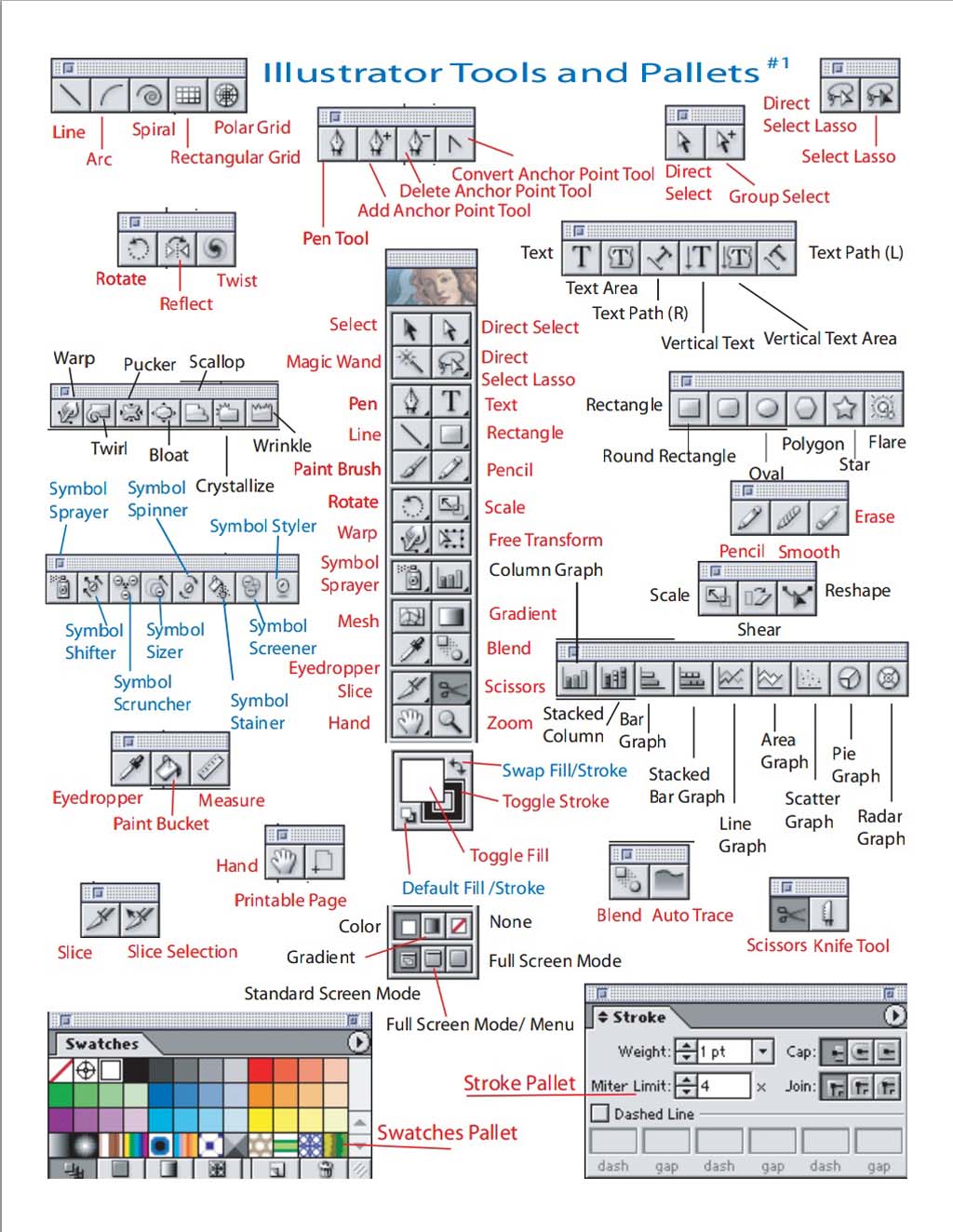
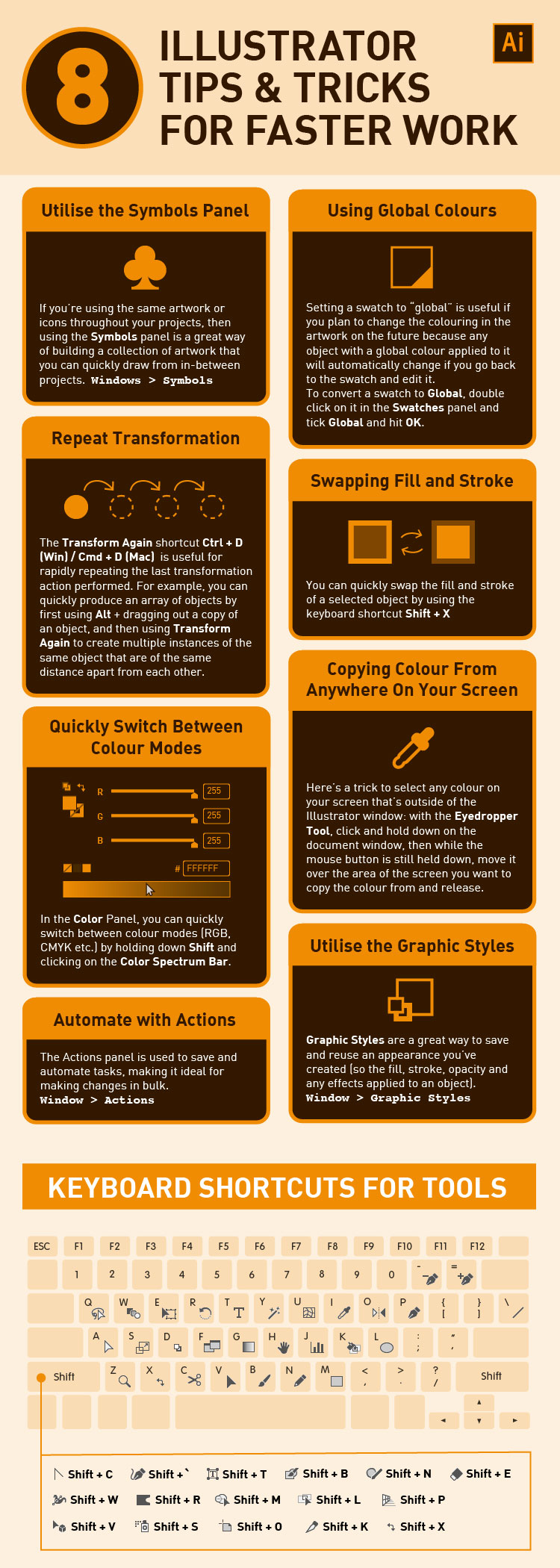
Review with your instructor the basics of Illustrator. It will take some time to learn how to use the different tools Illustrator has to offer. Once you have an understanding of the Illustrator common tools, start to experiment and see how different tools affect the graphics you create. Use the tutorials, video's, and Intro links to go at your own pace, reinforce and familiarize yourself with the tools and methods that Illustrator has. Once you have experimented with all of the different tools and methods to modify, edit, and change the type to create your onomatopoeia. Below are some key terms, tools, and process related to using type (text):
- Layout & Cust
- Text pathways
- Format Type
- Typography
- Font
- Fill & Stroke
- Stroke
- Kerning
- Leading
- Vertical scale
- Horizontal scale
- Baseline shift
- Rotate text
- Spacing
- Warp
- Mesh
- Outline
- Effects
- Add gradient
- Layers
- Rasterizing
- Appearance
- 3D Text
Below are some resource links for you that introduce Illustrator and also include some related tutorials, and videos:
- Adobe General Support
- Illustrator in 5 MINUTES! 6.13
 Intro to Illustrator 10p
- Illustrator in Detail 639p
- Illustrator CS6 Tutorial 19p
- Intro to Illustrator
- Illustrator Basics 6pts
- copy art board- layers 3.37
- Rulers and Guides
- Working with Type
- Type Tool
- Typography tools
- Typography Tips in Detail
- How to use the Type Tool 7.31
- Vector Tutorials
- Tatoland School
- Text Effects
- Comic Lettering 1
- Comic Lettering 2
- Text Effects Tut. 1
- Text Effects Tut. 2
- Text Effects Tut. 3
Editing Type in Illustrator
One thing to keep in mind when working with Type text, is there is a number of changes you can do to text and still retain it's future vector modification ability, i.e. keep it reusable and editable. This is what you want to focus on first to get the design intent you are after. Changes such as font, spacing, kerning, baseline, effects, and even ![]() appearance tool pallet still allow you to go back and edit the base text and is considered as non-destructive and can be reusable or applied to other type.
appearance tool pallet still allow you to go back and edit the base text and is considered as non-destructive and can be reusable or applied to other type.
If this does not give you enough flexibly and freedom to push your design to the next level, you would have to rasterize your text object or use conversion to outlines to edit . This will give you that much more custom unique control over your design, but at the same time you loose that ability to go back and edit your text, as the those tools are considered destructive and non-reusable.
Proper Illustrator Page/Art Board Set-up
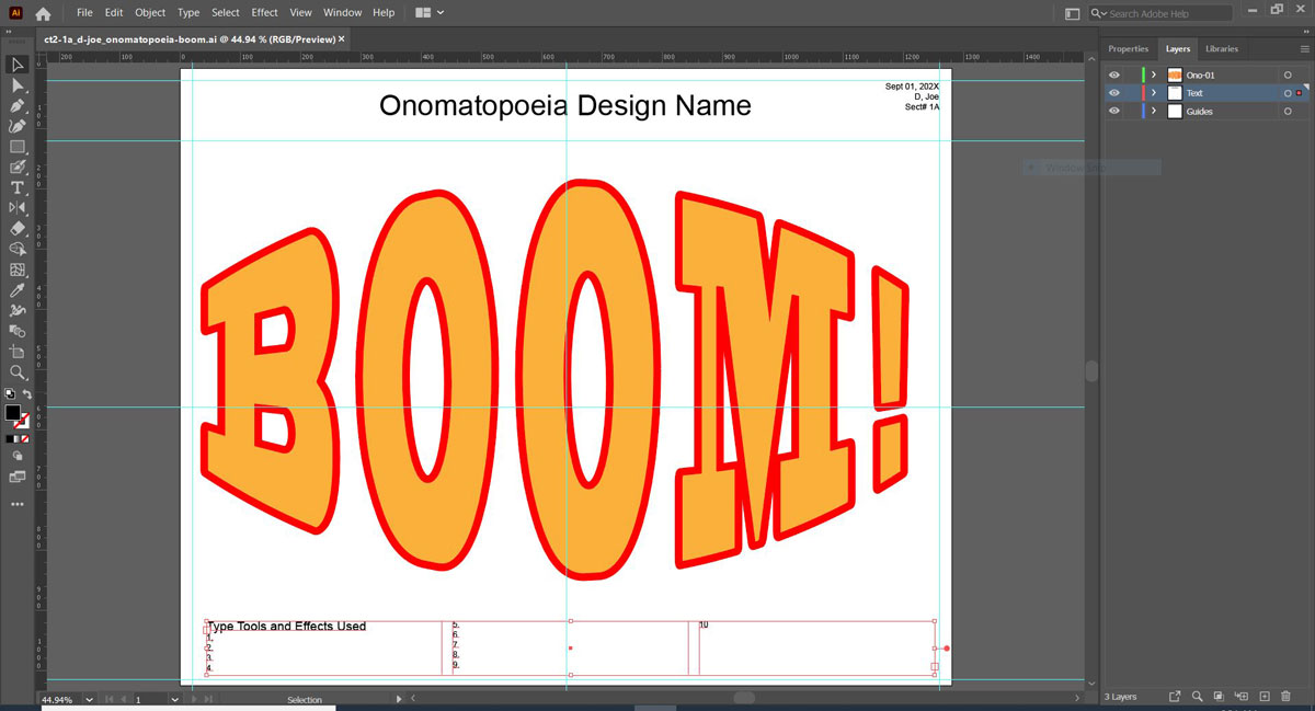
Sample Layout
Opening up Illustrator for the first time you will be offered to to go to their website support page if you are interested. The following are some common things for set-up page and steps
- Select create new file with a preset "Web" 1280*1024 landscape size with it's defaults and click create
- Suggest you change workspace layout from Essentials to Layout (located by Adobe search bar) and you may want to go through Preferences in the Edit menu, to refine set up parameters for your environment workspace
- Turn your Rulers on (found in View Menu), and name the current layer to "Guides", then pull boarder guides off of rulers at 20 pixels for boarder limit, and create a 100 pixel spaced header guide at the top, then create two guides marking the centre of page-body 562 (1024-140/2) and 640 (1280-40/2)
- Create a new layer called "Text" where you can enter using your type tool, one line title (Arial 48 pt), date, name, section (14 pt) on top with right alignment and also create a paragraph box, titled "Type Tools and Effects Used" (Arial 21 pt) with bullets 1-10 (Arial 14 pt) at the bottom right or left - ready to put your effect technical names and what each was used for
- Now you can create main layer for your Onomatopoeia, call it Ono1, and if you need more layers, then Ono2, etc
- Using the text tool, type your onomatopoeia word, then select the font and size up to fit page. Experiment with different type tool settings, work with the Appearnce panel to adjust and add effects, experiment with other tools, and if you need more control try out the outline tool (remember it is destructive - no more font or type tool ablities) for individual custom object control
- Remember you can only modify the text element itself and can't add any other elements and/or background - just work on the word and individual letters themselves using related Type tools, fills, outlines, related editing tools, and effects to get at least 10 different types of edits
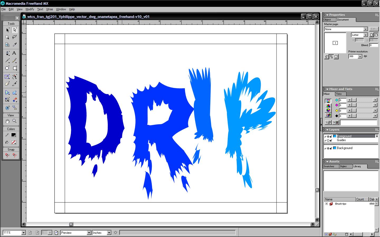
Student Samples
The following are some examples of past projects done by students:
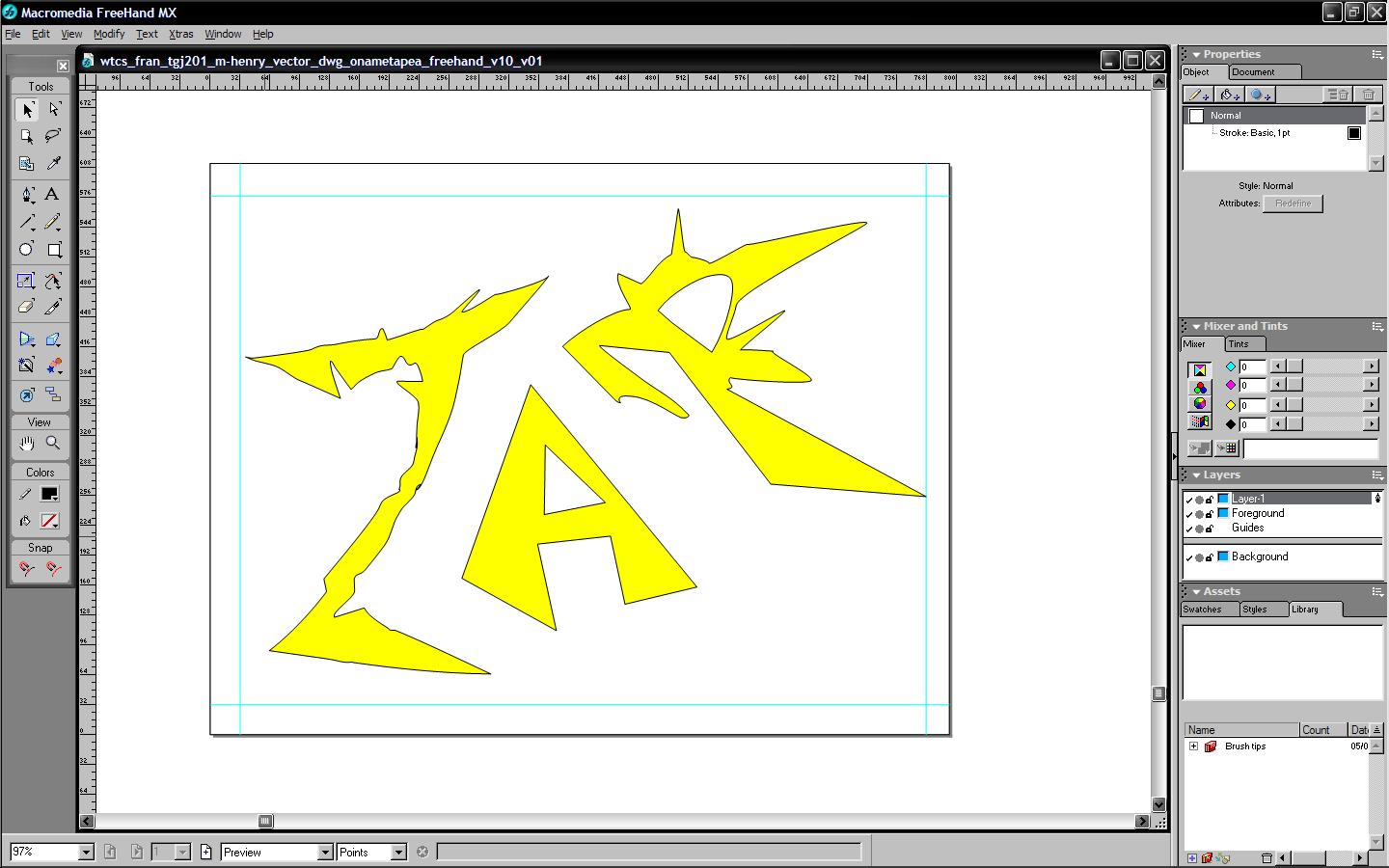
Sample 1

Sample 2
Sample 3
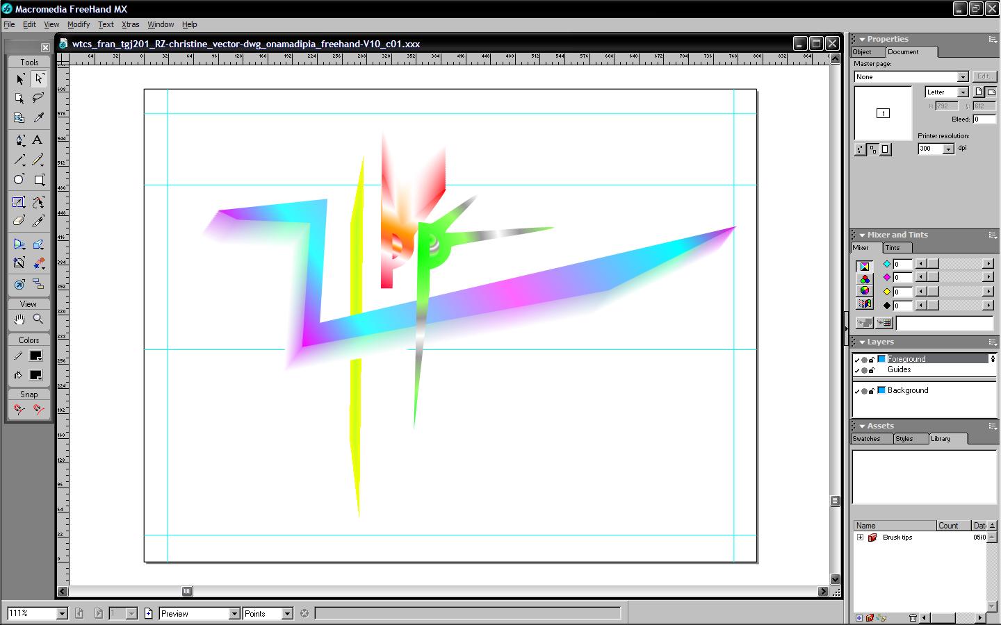
Sample 4
Create/Construct:

You will need to follow a process that should become habit when creatively designing something from scratch.
Sketching Basics & Shapes
- Sketch the Sketching Basics practice using the techniques learned in the lesson and support resources from the sketching Intro and tips and submit for feedback before sketching shapes - will be looking for layout of page, using sketching techniques, light weight lines, clean straight lines, circles drawn based on 2 and 4 crosshairs with distance ticks, and completed header
- For the second Sketching shapes, use the feedback from your Sketching Basics, to improve your sketching along with lesson on drawing 3D basic shapes, and focus on light line weights for first pass on layout and shapes. Do a second pass with heavy thicker consistent weight for shape outlines. By learning 3D drawing, will allow you to add 3D to your future sketching

Sketching
Basics
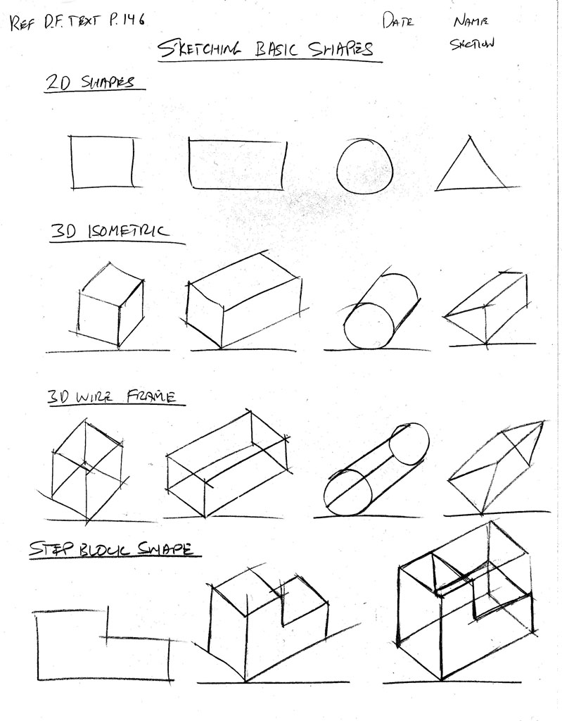
Sketching
Shapes
4 Ideas to Sketch
- Using the sign-up sheet, select 4 unique onomatopoeia words to use for your project design
- Take a blank sheet of paper, pinch ends into four equal spaces (landscape orientation) with space for header to include title, name, date, and section
- Sketch in pencil, 4 different onomatopoeic thumbnail ideas, filing each section of the page showing visual details, labeling colours, and effects
- With 4 finished ideas, narrow down to two final design ideas, to draw in Illustrator, and show your top two selections using an asterisk
- Digitize your sketch to a PDF and submit to teacher for feedback, marks, and approval
2 Ideas to Draw in Illustrator
- Using Illustrator, working with one idea at a time, create your onomatopoeia using the above Illustrator page-set-up and type tools practiced and support resources
- Once you have created your page set-up, you can duplicate to other art boards so you don't have to redraw your page set-up for each, then "place" (import) your PDF of your sketched ideas on to the first art board, and your two onomatopoeia will be on art boards 2 and 3, so all your work is in one file
- You may want to add more art boards to create various design versions, just remember your ideas should be with-in the scope of your original approved ideas, but can be improved with additional and/or technical effects and experience you have gained
- The finished product design can only use the lettering object entities them self and no other added vector graphic objects, backgrounds, and/or colour fills may be used and must fill the landscape orientation of page, i.e. maximize the use of space you have
- Teacher will be looking for evidence of proper page set-up (layout), guide lines/layer, a use of a minimum of 10 related type tools, manual and auto effects, whole and individual letter modifications, layers and art boards named appropriately, and a numbered bulleted list in 14 font Arial text box (3 columns), what those 10 technical tool names you used are, located ath the bottom of art board, with your design, header title, date, name, section at the top of each art board
- Once finished the first idea, work on your second idea exploring different tools and effects for a your second design, again listing your 10 technical tool names at the bottom - note layers for your written text, layer for your guides, minimum one layer for your Onomatopoeia or more if needed
- Save your file in the standard .ai file format and when done also export to a .pdf to hand in both file types for your production designs
- Finish by creating a JPG of all three art boards to place in your class share JamBoard - Best way to do this, is re-arrange your art boards into one column with 20 px spacing, then use the Export, to Export for Screens tool, adjust settings for all three art boards, for full document, with no sub folders, with a 0.08x scale for a JPG 20 output
For your convenience, here is an example of the file names you should be using based on our ![]() tech info
handout, for your submission:
tech info
handout, for your submission:
- File name: ct2-6a_d-joe_onomatopoeias.ai
- File name: ct2-6a_d-joe_onomatopoeias.pdf
Evaluation:
Final ideas will be evaluated for process, designs, use of sketching techniques, use of illustrator type tools and related tools. Final product will also look at layout, tools used, design and creativity of your word onomatopoeias.
| Evaluation Breakdown Component Descriptions | Marks |
|---|---|
| Always double check that you have completed all components for full marks. | |
| Sketching Basics - page layout, line weights, straight, curves and circles | 10 |
| Sketching Shapes - page layout, line weights, shapes, lines, and angles | 15 |
| 4 Ideas Sketched - layout, header, designs, sketching, labels, & notes | 25 |
| Design Illustrated - layout, design, creativity, 10 tool/effects, .ai/pdf | 40 |
| Design Shared - Export JPG placed in JamBoard - 7 and 3 | 10 |
Unit 2, Act. 2: Graphic Logo Design
Situation:
Continuing to expand on creative design and learning how Illustrator work with specific related tasks, will help further familiarize yourself with design principles and application tools. It is common for businesses and individuals to want to associate themselves with unique or personal "markings". These markings are commonly referred to as "brands" or a logo. While it is quite true that you are not a "brand", you are actually an individual with a self-perceived identity. As a student in graphic communications, you have the opportunity to design and illustrate ideas that express that identity in a quick, simple graphic and attach it to different mediums.
Problem/Challenge:
Design and create from scratch a graphic pictorial, abstract, or combinational mark professional identity logo and slogan or catch phrase based on your
- Your future career
- Your character strength(s)
- Your integration with technology
Both your logo and slogan are to be used to create a "business card" and letterhead design. The logo design process is to include the following steps, shown on individual art boards:
- Choose a Name
- Customer and Competitors
- Competitor Analysis
- Mind Map
- Mood Board
- Draw - Sketch your Ideas
- Illustrated logo Display
- Business Card & letterhead sketches
- Illustrated Business Cards
- Letterhead Google doc design
- JamBoard Showcase Share
The logo design intent to based on 1 unit high to a ratio of 1 to 3 units wide using at least seventy-five percent of square/rectangular space allocated with your design. Specific requirements of your logo and mediums are as follows:
Logo Design Display
- Letter sized 8.5 * 11" portrait
- 1/4" outside print margins
- Ruler, guides, layers, & effects
- Maximum 3 primary colours
- Colour & B/W versions
- Half page and 1" scaled samples
- Design to include:
- Logo design
- Slogan
- Background and foreground
- Layers, shapes, lines, fills, etc
Business Card Print Master
- Letter sized 8.5 * 11" portrait
- 1/4" outside print margins
- Graphical background
- Catch phrase or slogan
- 3.5 * 2" standard card size
- 1/8" card margin spacing
- Business card info (fake):
- Your name and school
- Related catch phrase or slogan
- Address, E-mail, and Phone
- Social handles, etc.
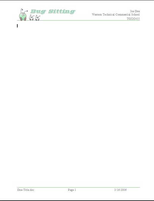
Letter Head Document
- Letter sized 8.5 * 11" portrait
- Set margins for header & body
- Logo & slogan
- Complimented design
- Header/footer to include:
- Course, name, date, & section
- File name & page number
- Body to include:
- Logo- what, purpose, process, Ai tools
- Feedback on logo design
Logo design will be saved and handed in with the Illustrators proprietary file format AI, and also the common standard PDF format and letterhead as a Google doc.
Investigation/Ideas:

Important Concept
Logo's
Designing and creating a branding for yourself as a professional student will take some effort to identifying key components that you want to brand. In order to do that some research should be done to help you with graphic imagery and related slogan to match. As logo's are usually seen as a small part of what it is a part of, they need to be simple, eye catching and memorable. Looking at samples, a lot of the corporate logo's just use lettering to a great degree with graphics as a secondary. We will look at Logo design, elements and principles of design, more illustrator techniques, and resources.
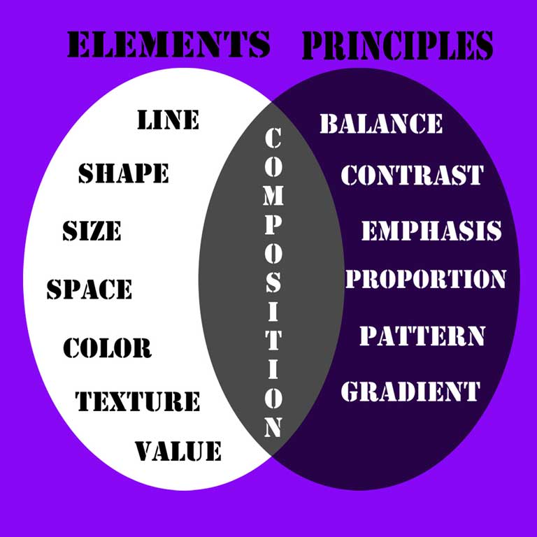
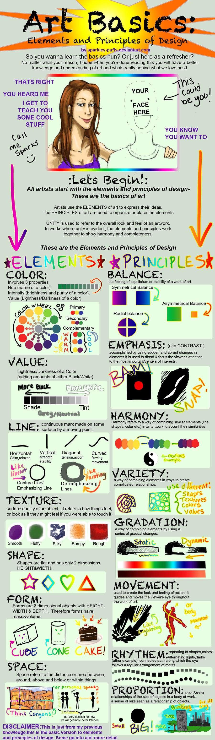
Elements and Principles of Design
The principles and elements of design are an important part of understanding the technical concepts of graphical design. Understanding this will help you with graphical design related work. Check out matrix 1 and matrix 2 to see different samples of each. The following links will give you more information on this key topic:
 Elements and Principles of Design
- Elements & Principles of Art /Design Accordion-Book Dictionary
- Elements & Principles of Design and Art
- Elements and Principles of Design
- Elements and Principles of Design 14.20
- PDF summary note
- 4 Logo Principles 10.05
- Improve Your Logo Design 6.12
Logo Design
Here are some links to give you some more information on what a logo is, logo design process, and converting from an image to logo:
- What is a Logo? 2.45
- The Art of Logo Design 6.28
- The 7 Types of Logos 2.46
- Designing a Logo
- How to Design a Logo
- Design a killer logo
- Guide to Mood Boards
- Brand Identity Mood Board 5.09
- Design Your Own Mood Board 4.36
- Picture to symbol/logo 1 & 2
- Logo Design Tips
- 65 expert logo design tips
- 10 Tips for Designing Logos
- Logo, Business Cards and Letterhead
- Graphic Design Mix Index
- Logo Design Process Peace 14.40
- Logo Design Process Carrot 16.19
- How To Make a Logo 12.16
- 9 Brand Design Elements 9.23
- *How to Design a Logo 28.18
Logo Samples and Placement
Another great place to start is checking out samples. As you will be applying your logo to a business card and letter head, you may find those related links very helpful:
- Logo samples
- Business Card layouts
- Letterheads
- Create a Word letterhead 1 13.03
- Create a Word letterhead 2 12.31
- Illustrator to word doc 5.41
- Letterhead in Google Docs 4.42
- Google - Make a Letterhead 12.06
More Illustrator Techniques and Resources
Think about keeping your logo design simple as it will commonly be used at a maximum of one inch in height. Looking at how to use illustrator to create amazing logos will help you understand and learn the steps and tools used in Illustrator, to create your logo and slogan.
- Bézier online practice tool
- Fun vector monster tutorial
- Setup Ai For Logo Design 7.13
- How to design a crest logo
- Logo Design Process 12.50
- Tools and resources for beginners
- All time best tutorials for beginners
- 15 great logo tutorials
- Vector Cove - Illustrator tutorials
- 20 Basic Illustrator tutorials
- 15 Logo Design Tutorials
- 101 Tips & Tricks
- Logo Design Techniques 8.26
- 10 Tips for Beginners 13.26
- 10 Incredible Tips + Tricks 9.28
- 13 beginner tips and tricks 18.53
- 10 Tips: Illustrating 11.39
- Linked vs embeded images 3.36
Illustrator File Setup
First consideration is setting up your workspace environment. It has several preset layouts which you can select and/or add additional customization as you like to improve your workflow and streamline the tools you commonly use, and make it easier to use. Once you have a workspace environment set-up the way you like, save it as a new workspace, so it is availabe when you start a project.
Setting up your artboards will depend on the direction you need to go with your project. Before you start drawing, it is a good idea to think ahead what you need, then organize your artboard(s) so you can focus on specific pieces you need to design and create.
Open New File with 6 Artboards
- Select Print templates then change pixels to inches, select portrait, add 6 artboards,
- Change colour mode from CMYK to RGB, change from 300 to 72 DPI
- Click on "More Settings" set artboard layout for Grid by Row with 3 column and 0.5" spacing
- Click on Create
General Layout and Guide
- Set grid spacing to 1" with 2 subdivisions in Edit >Preferences>Guides&Grid, then in View, select Snap to Grid
- Create Guides-Gen layer and add 1/2" edge guides and centre guides using Alignment distribution vertical and horizontal tools for all artboards
- Create 1" header space with guide line, then lock your Guides-Gen layer
- Create new Header Info text layer, and add Arial 24 font: Logo Title, with center alignment, then use Alignment distribution tool to align title vertically between header and edge guides, and again align horizontally between vertical edge guides
- Add 3 more text lines for Date, Name, and Section with Arial 14 font, right aligned, then place top right corner of header, then copy Title and Owner text to the first 5 artboards, update each title and on the Logo Display board, remove the Owner info so 1" Logo samples will fit in corners, note you will need to turn off Snap to Grid to place
- Name your 6 artboards in order of our project steps: Mind Maps, Mood Board, Logo Sketches, Logo Display, Bus-Letter Sketches, and Business Cards
Business Card Layout
This will be based off of a standard printable Geographics business card blank, that you can purchase from your local office supply store, when you want to actually print them.
- Set grid spacing to 1" with 4 subdivisions in Edit >Preferences>Guides&Grid, then in View, select Snap to Grid, then hide Guides-Gen layer in layer panel and ensure Snap to Grid is enabled
- Create Guides-Bus Cards Layer, and add 3/4" vertical edge guides and 1/2" top & bottom edge guides, add vertical centre guide using Alignment distribution vertical tool, then lock this layer
- Create a new layer: Bus Card Outline, then make a rectangle 3.5 * 2" with no fill and snap to top left corner, copy and paste 4 more, then place vertically down below your first one with no spacing between
- Copy all five rectangles, Ctrl C, Ctrl V, then move and align to the right
- Once they are all placed correctly lock layer, and you are ready to create your business card design
Sample Work
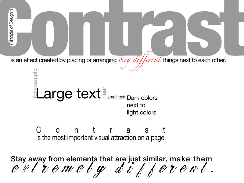
Ensure that you focus on creating complimentary designs for each of your mediums. For example the business card may have a background to support and add to the logo. Contrast is a key concept in design that could give the logo more focus on the business card layout, as you want it to standout and be memorable.
Logo Display
Bus. Card
Letter Head
Several online resources such as Dribbble, Behance, Unsplash, Designnspiration and colour.adobe are all great graphic resources to search with-in for your mood boards as a starting point. When placing images in Illustrator, be aware there are two methods of saving; link or embed. Link does not actually save the image but rather creates a space holder then pulls the image from the original source, where as an embedded image is actually saved in the file. Illustrator links the image files by default to save file space, although in some cases you may need to embed, so that when sending file to another person, the linked image off of your hard drive can still seen.
Create/Construct:

General Logo Design Steps
Using the general process below should allow you to come up with lots of ideas and focus you to your final idea. You may want to review ![]() *How to Design a Logo for Beginners 28.18, to see a full walk through on coming up with your logo design. Skipping steps will make it more difficult to finalize your idea, loose marks, and required direction of your career, integration with technology, and your character strength(s):
*How to Design a Logo for Beginners 28.18, to see a full walk through on coming up with your logo design. Skipping steps will make it more difficult to finalize your idea, loose marks, and required direction of your career, integration with technology, and your character strength(s):
- Choose a Name - create a brief, big picture, what brand you are to communicate, use your career, your last-initial-first name, slogan (catch phrase), note: steps 1-3 can be done using Google Doc
- Customer and Competitors - narrow to specific ideal customer and competitor companies
- Competitor Analysis - look for pictorial, abstract, or combinational mark type logos to copy for background and comparison (10)
- Mind Map: create in Illustrator, by first setting up a file with an 8.5 * 11" portrait, RGB, 72 DPI with 6 artboards, then using the first artboard and your Logo Brief, write down 15 words characterizing your logo design, Next, pick and highlight 3 key words that best represent the direction you want to take your design in, and expand with 3 mind maps of 10 related words for each. Find a main theme, connection, pattern and/or object direction and put your final word theme in the bottom 1" space, with an explanation
- Mood Board - add 20 related objects - images, illustrations, line work, type, textures, colours, etc - fill art board 2
- Sketches: sketch 10 different thumbnail ideas based on your object theme for the visual graphic part of your graphic/type logo with key descriptors such as colour, intent, etc, on a blank portrait letter page laid out using sketching techniques (light construction lines for grid spacing), number each idea, and 2 weighted lines -thin-light construction and heavy-thick object, then select and show final design with an asterisk and box around it (later to place on artboard 3)
- Logo Display: create/draw your logo design (graphic and type) for both a colour and a black & white display on artboard 4, full size in body top/bottom and 1" high placed in header left/right sides.... include labeled colour swatch boxes for solid, texture, pattern, and/or gradient colours used
- Business Card & Letterhead Designs - two sketched designs of each, laid out on a portrait page orientation, to be later embedded on art board 5
- Illustrate Business Card - final design in with logo, slogan, contact info on art board 6, then submit the whole file (all artboards) with Ai and PDF
- Letterhead Design done in Google doc with usual header information, and footer to include file name and page number. Body to include title, explain what a logo is, its purpose, the main steps, 4 major Ai tools used and their operation, and conclusion, take-away, and learning.
- Using JamBoard, export your colour and black & white logo display design, to showcase with the rest of the class
Sketching Steps
- Remember to layout your page with light construction lines for your header and create a grid for your body
- Use both light lines to start your ideas, then thicker darker lines for your finished idea
- Ensure your design shows and describes your design based on the requirements (explanations)
- Clearly identify your final design with an asterisk, properly digitize your work to submit online for approval, feedback, and marks
Illustrator
The intension here is to explore and use several tools and methods that Illustrator has in creating a logo. Having your idea sketched out on paper now will allow you to focus just on making your logo, using Illustrators tools. Follow live demonstrations, check out the resource links provided, and practice using the tools in Illustrator to learn more about using different tools such as the pen tool, shape builder, pathways, grids, guides, etc. You can also review linked tips and tutorials above to see different methods of creating logos which will help you with your steps to get the graphic results you are be looking for. You will need to create
Evaluation:
Final ideas will be evaluated on process, layout & organization, design & creativity, sketching techniques, Illustrator tools, and the use of elements and principles of design.

| Evaluation Breakdown Component Descriptions | Marks |
|---|---|
| Always double check that you have completed all components for full marks. | |
| Logo Brief - big picture, brand, career/name/slogan, & competitor analysis | 15 |
| Mind Map - 15 words, 3 *10 mind maps words, final object/theme | 25 |
| Mood Board - 20 graphic related objects organized on board | 15 |
| Sketched ideas - layout, 10 #'ed logo thumbnails with short descriptions | 20 |
| Illustrated Logo display - layout, 1*3 ratio, full size & 1" high colour b/w | 30 |
| Stationary Roughs - 2 sketch designs for bus. card and letter head | 15 |
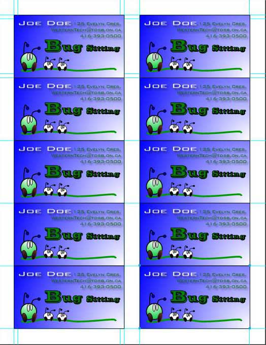
| Business Cards - layout, card design, info, 10 duplicates | 15 |
| Letter head - header/footer, 1" logo, info, body feedback, S/E eval. | 20 |
| Design Shared - Export JPG placed in JamBoard - 7 and 3 | 10 |

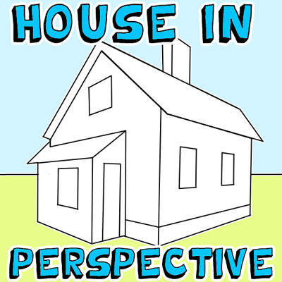
Unit 2, Act. 3: Design Your Dream House
Situation:
Imagine you are a new illustrator assistant of a residential developer and the boss would like you to draw him a dream house concept to be used as a design idea to help the architects come up with some new ideas. All he wants is a elevation perspective view from the front. This is the perfect opportunity to work with some of illustrator's core tools to come up with an awesome design. For this reason you will have the opportunity to experiment and make what you think your dream house should look like.
Problem/Challenge:
Create a dream house that must have the basic necessities such as a garage, doors, windows accompanied with landscape, sky, moon or sun, trees, bushes, driveway, etc. The dream home setting you create is to show the house 75% of page with 25% landscape/sky also showing perspective. Use appropriate tools to design and build the house, landscape, and background. Remember to keep in mind Principles and Elements of Design recently introduced.
Investigation/Ideas:

The following list of concepts and Illustrator tools should be used while completing this task:
- Sketching and Techniques
- Principles and Elements of Design
- Vector vs bit map drawing
- New file size: web profile 1024*768, guide set-up
- Shapes, pencil, pen, shape, and brushes
- Paths, colour/strokes, layers, transparency, and styles
- Stroke, fill, gradients, and effects
- Specialized tools
Ensure that you review the principles of design, which include major concepts; contrast, emphasis, balance, unity, pattern, movement, and rhythm. You will also want to keep in mind the elements of design which include; line, shape, form, colour, value, texture and space. The following resource links may assist you with your drawing/illustration process by following and looking at more related tutorials:
- House Illustration Idea
- How to draw/sketch
- Two point perspective house
- How to draw in two-point perspective
- Simple 3D house tutorial
- Building tutorial
- Cozy wooden house tutorial
- Creating Vector Landscapes
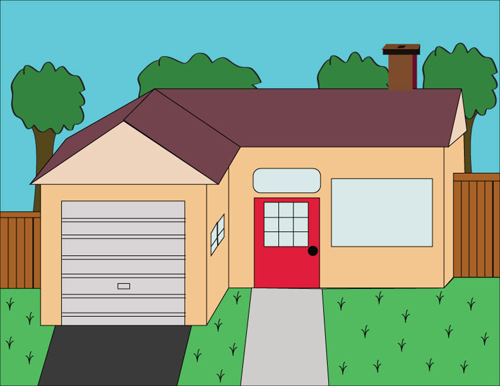
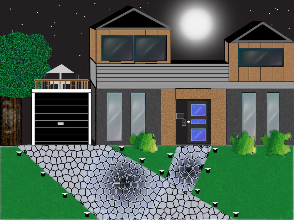
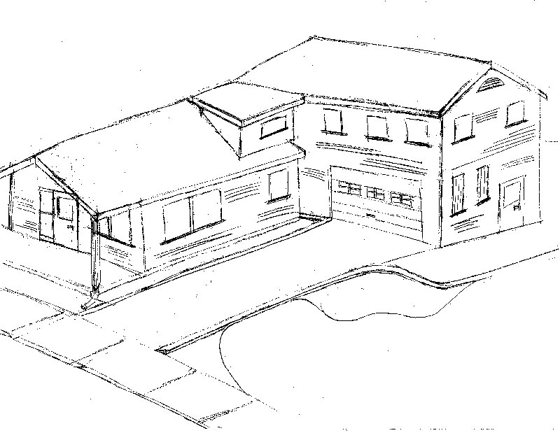
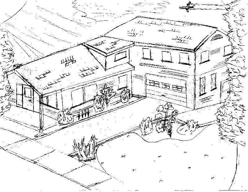
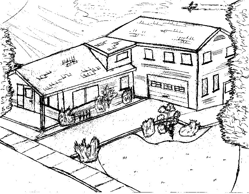
The following are some samples that were done in the past using a similar vector/illustration software application. Notice that perspective was used with their creative design, showing use of the many colours, patterns, brushes, gradients, and text tools that illustrator has to offer.

Sample 1
Sample 2
Sample 3

Sample 4
Create/Construct:


Creating your Home Design
Start by creating a full page basic sketch of your dream house showing doors, windows, levels, landscape, driveway, background, etc. Try to add perspective to your house with different settings. Use the web to get some ideas from several different designs.
Sketching Steps
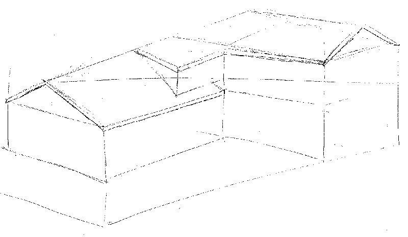
Step 1
Rough in
Step 2
Object details
Step 3
Landscape
Step 1
Object lines
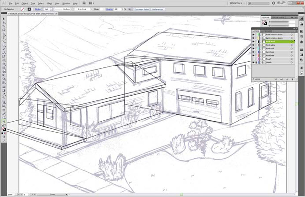
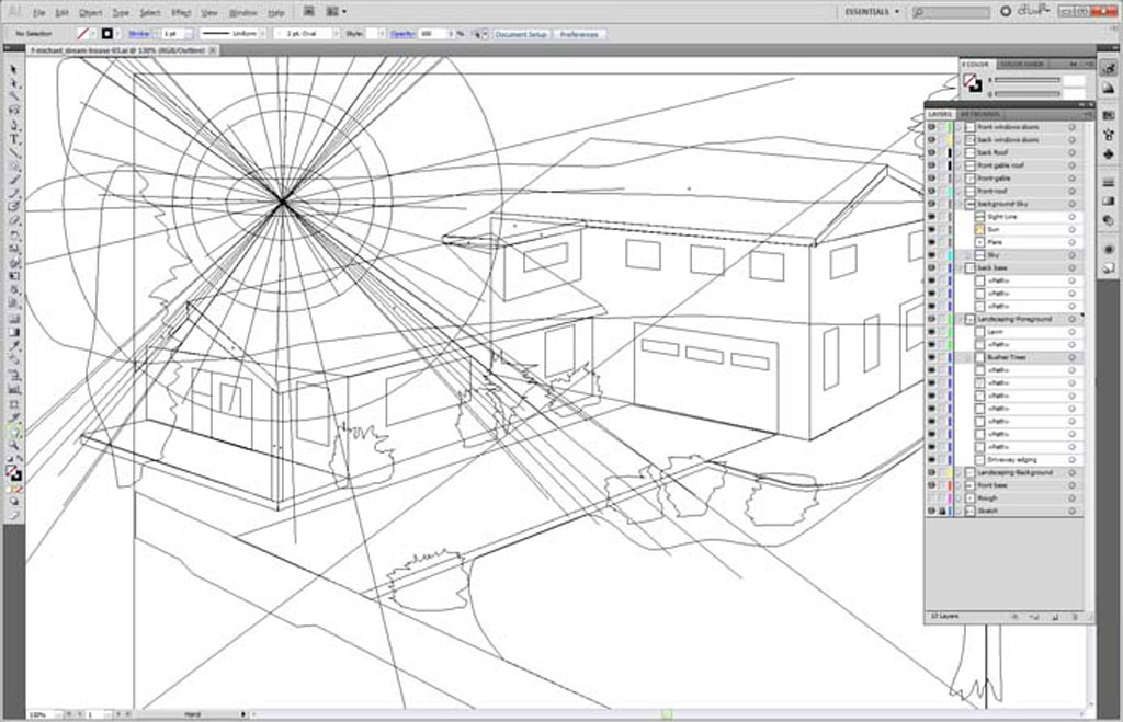
Meanwhile during class, take some time to experiment with Illustrator tools, creating some basic shapes, making parts of the house and landscape to use with your dream house creation. Once you have completed your sketch and have practiced with Illustrators tools start a new web profile file 1024*768 and set-up guides, grid, ruler, etc. Scan in your sketch, so that you can use it on a separate layer and dim to 25% to help you build your perspective design in Illustrator.
Create a number of layers such as House, Windows, Doors, Roof, Driveway, Trees, Sky, Grass, etc, as you will need to be able to organize your objects with-in each layer. Draw your house features starting with the largest parts working to the smaller details. Focus on closed objects with no fill initially. Make sure to use solid closed objects so that you can fill and outline properly later. Change from Preview to Outline view to help during illustration build. Try to experiment and use as many tools as you can to further develop your skill, as you further your illustration dream home design.
Illustration Steps
Step 1
Rough Layer
Step 2
Details
Step 3
Fills

Step 4
Refine
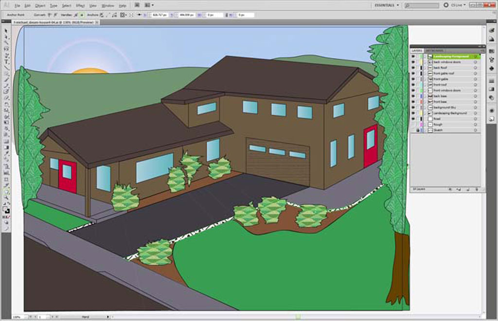
When you have drawn the basic house, some foreground and background, then you will need to organize your layers by naming them and putting them in the appropriate order so that they are viewed properly. Next apply a temporary fill to view your house layers. Ensure you finish house, landscape, etc. first before spending time hunting for the exact right texture, pattern, brush, style, effect, etc. go through the sample libraries Illustrator offers first to save time.
It is possible to make your own swatch/brush libraries, and/or just do a search and find an appropriate swatch that you need for exact look you need. Using the right search terms, you can download free illustrator swatches, patterns, gradients, styles, brushes, etc. Here is a sample site for getting swatches, all-free-download.com. If you find some great resources, save them to the Hand-in folder, under the appropriate folder, and the instructor will then provide them in the Pick-up Folder for all to use.
Fill the page so that your use of "space" creates a nice balance and remember to review and apply your principals and elements of design. While working, save your work to your USB flash stick and backup to your H drive.
When you are close to finished have two peers give their input and make any improvements as needed. If you are finished early, have your instructor also review it prior to handing in. When handing in, you will submit it in the hand-in-folder as discussed in class, in the default .ai format and also export to a .jpg format. Ensure the file extension is correct and present.
Evaluation:
Use this section as a check list to make sure that all the major components of this activity have been completed

| Evaluation Breakdown Component Descriptions | Marks |
|---|---|
| Always double check that you have completed all components for full marks. | |
| Sketch - house perspective, details, landscape, background, and foreground | 20 |
| House design and Tools - overall design, line, text, shapes, layers, brush, stroke, and fills | 60 |

Unit Conclusion
Learning about vector digital graphic design, creation, and editing plays a very important role in the digital graphic communication world. Understanding and practicing the creative design process, elements and principles of design, sketching organization, layout, and techniques, and finally working with Illustrator's vast number of tools further empowers your ability to express your creativity through design, the creative design process with some very powerful skills that can also be applied to future digital graphic and multimedia projects.